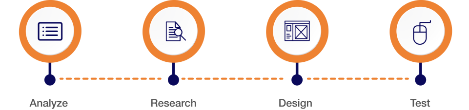
Improve chat capabilities:
Most of our users complain about “Your chat feature didn’t work.”
Some bankers and individuals asking “Why do you have a chat support service that doesn’t populate?
Recommendation:
Users want enhancements and reliability with chat functionality. So, It would be helpful if it worked so I wouldn’t have to call in for simple fixes.”
Login Issue:
User facing login issues on login page.
Recommendation:
A new login feature with biometric and passcode has been added.
Slow Response Rate:
User said, most of the pages response is too slow.
Some users said that the processing of payment is stuck sometime.
Recommendation:
We are added improved code and Bug fixes on new release.
Technical glitches:
Some user tell about “App crashes after they submit payment every time. Leaves me uneasy
if payment went through and question if app is secure.”
Recommendation:
Users want to be reassured their payment is successful and data is secure.
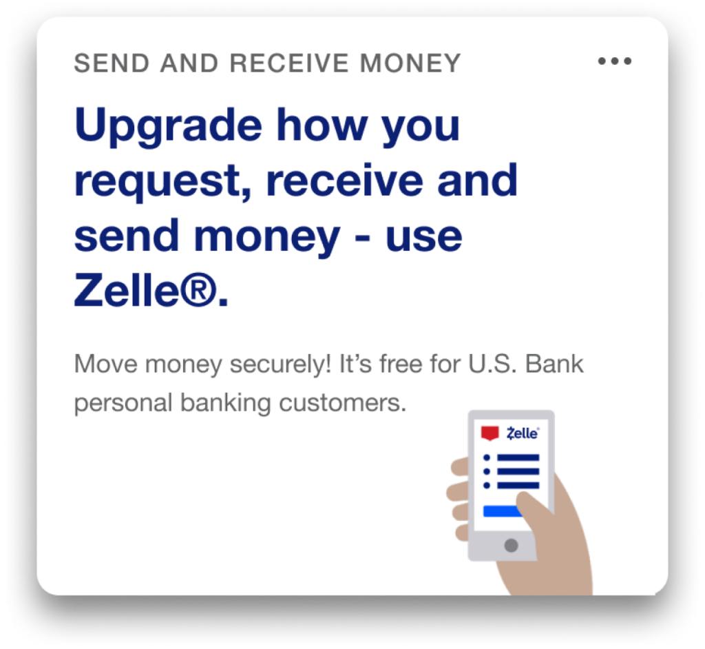
Payment:
Several users said, “More info on how to pay the principal. I keep paying extra but it’s only going toward the next payment.”
“The app is a little confusing of knowing where to click to see how payment was applied to principal and interest.”
Recommendation:
Users want to be more informed about loan payment nuances.
Show payoff amount:
Most user said, “In app, it is not showing the actual display, true full-payoff amount.”
Another user suggest “It would be nice that when someone is paying off a student loan that there could be an option to just pay it off.”
Recommendation:
Users would like more transparency when it comes to paying off their loan(s).
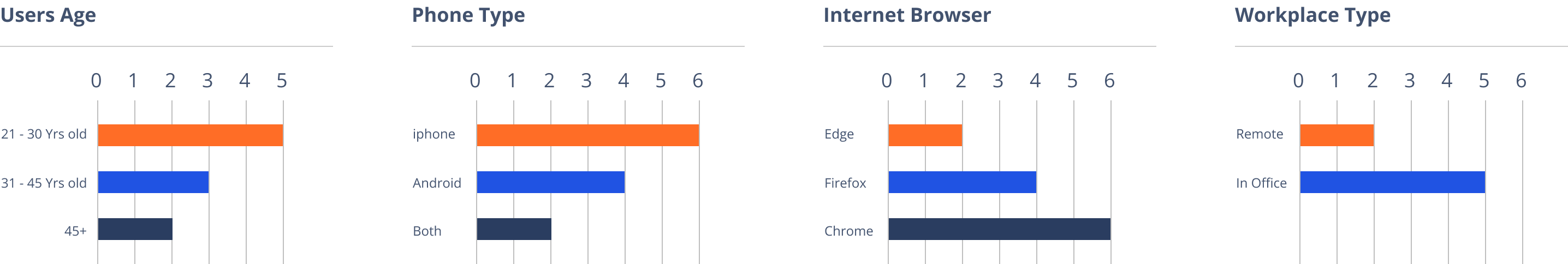
To understand the views of other users about our website, I’ve used the survey method for collecting data from the users world wide.
Question:
How satisfy are you with this new website design?
Jeff Said:
We have been very happy with new website! It looks professional and very easy to navigate. You handle things very efficiently and are available for any questions we have.


Question:
What kind of device do you use the most to access websites?
Brain Said:
I spend too much time browsing the internet. I have an iPhone and a Fire Tablet that I use mainly. It seems we are moving toward a future in which our smartphones will be our only connection to the internet
Question:
What kind of difficulties do you face while browsing the website?
Martin Said:
Some websites loading time is too slow, When I browse something, I am facing an irritating popup with bad color combinations and designs. Unnecessary countdown timer for downloading and loading pages.


Question:
What are your thoughts on our new website?
Steve Said:
I honestly wouldn’t spend more than 5 seconds looking at your old website. It doesn’t seem professional or informative. But now, your new website looks nice with good relevant content.
Question:
What calls to action do you want on our website?
Jenifer Said:
Calls to action are requests you give your audience to perform a particular action. You put all of these on a right place.

User Control & Freedom:
User can Cancel a download before it completes.
Consistency & Standards:
We maintain the consistency in our all design.
Flexibility and Efficiency of Use:
We speed up the interaction for the expert user.
Minimalistic:
We are Providing only necessary information in an elegant way.
Visibility of System Status:
Navigation menu items set to underline when a user hovers over them.
Help Users:
We are using toggle options to guide user.
John Smith
Self-employed
34 years old, lives in New York. Married with a 2-year-old child, has a middle-income level. He changed his occupation 3 years ago after getting married.
John was working for a global company and did not have much leisure time as his work was taking too much time. So, to start a family, he decided to quit his job and invest his savings in a bookshop, which has been his dream since his university years. All he wants to do is be able to maintain his bookshop.
Needs
Improved design should be scaled according to mobile trends and they should properly rewrite the information and detail and try to fix all bugs.
Pain points
Actual Information is missing. The app is too old and is not properly scaled according to mobile view. I am facing some payment issues and an app crash.


Logo and colors must present the bank as trustworthy and professional. A logo is the heart and soul of your bank, the image that differentiates you from other financial institutions.
The registered trademark symbol should be on the logo every time used. The relationship between the a and the logo is relative in order to maintain legibility in all sizes. Thee scale separately from the logo when it appears smaller than 60 px tall. At sizes smaller than 60 px tall, the • will always be 5 px tall. At sizes larger than 60px, (this ratio is reflected in the standard logo files available to employees and partners).


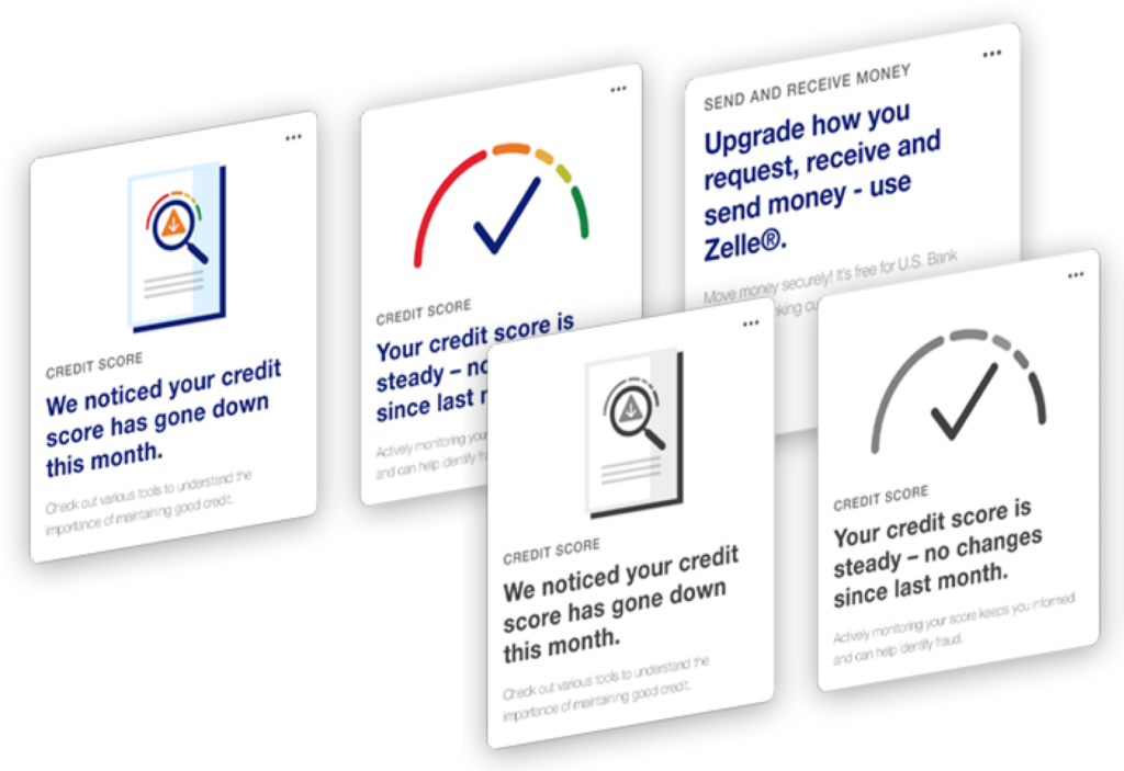
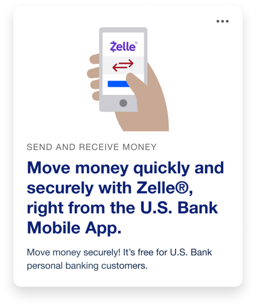
Illustration is contained in a rectangle or the symbol with a solid background of gray, blue, light brown and red.
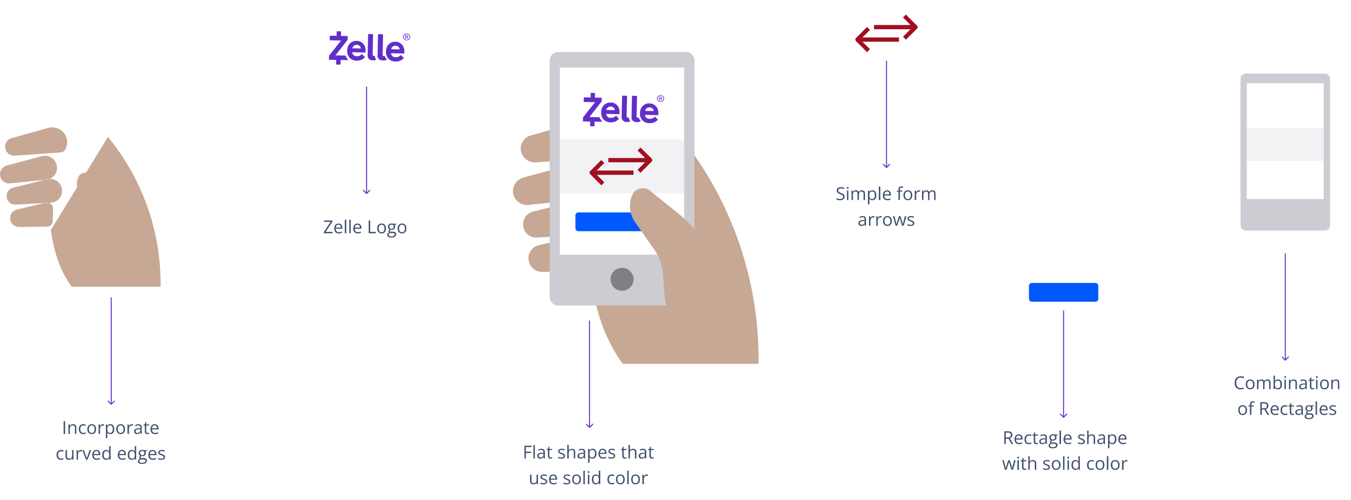
Use anywhere, It is accepted to make in-store, online and phone purchases.
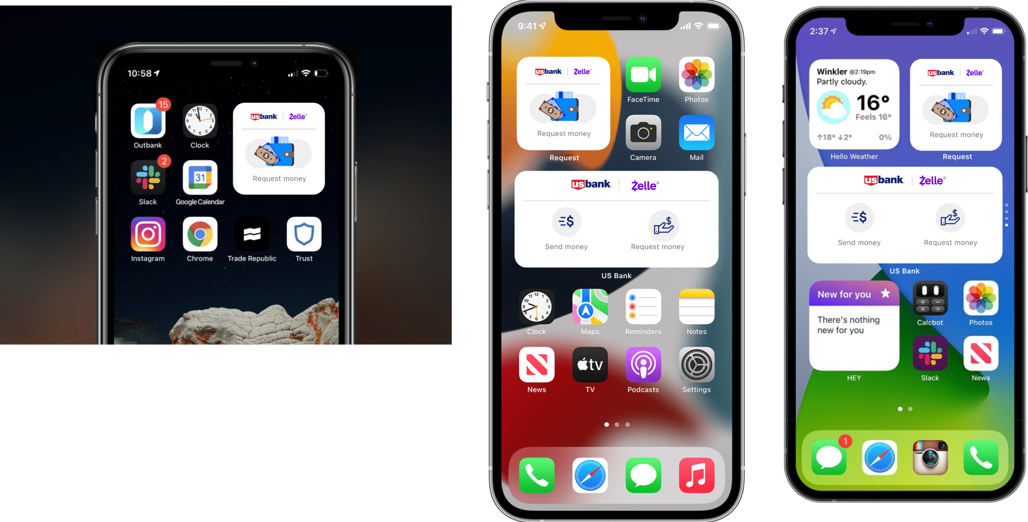
Mobile View
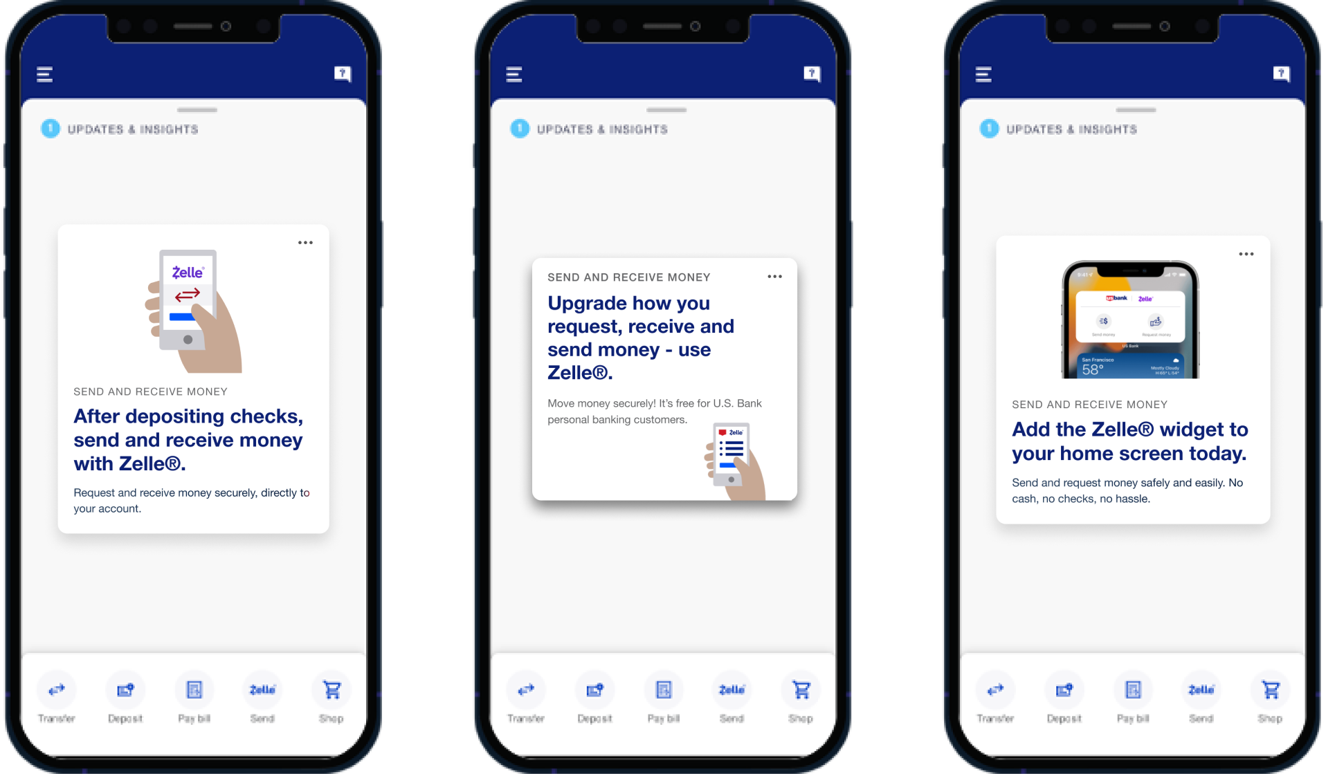
Widgets can be added to your phone’s home as a quick way to access certain information from apps without having to open the app itself.View