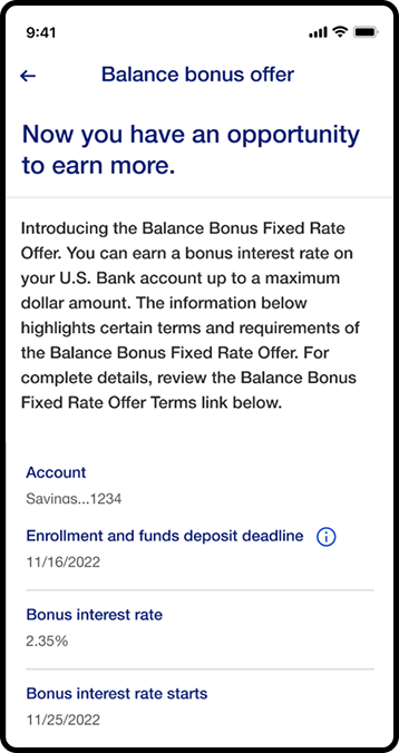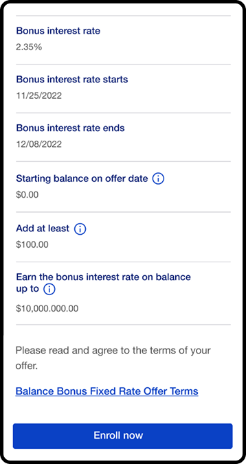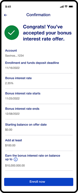








Augmented Balance Bonus

Augmented Balance Banner
Banner Mob
01

Overview

Overview

Augmented Design

Design

Augmented Puzzle

Prototype

Augmented Testing

User Testing

Augmented Bulb

Evaluation

Augmented Reflection

Reflection

02

User Problem

U UP
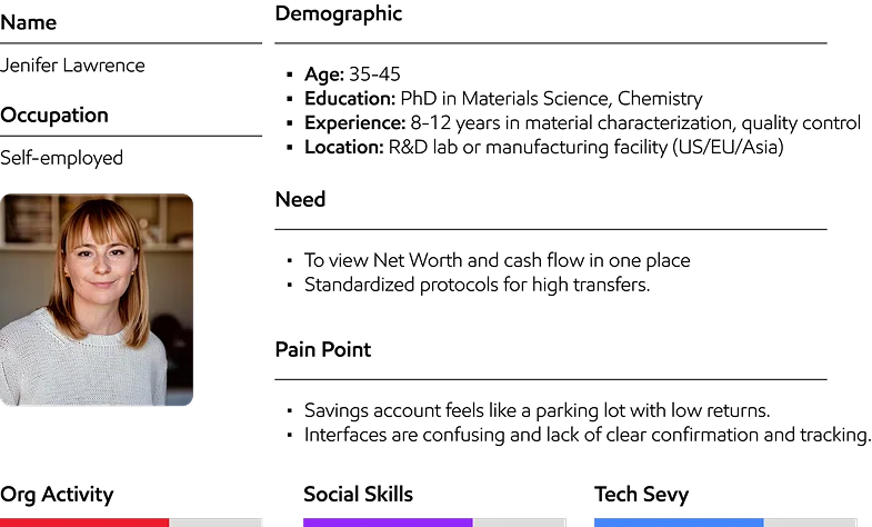
Jason

Jason N. Smith

Environmental Scientist

Lack of consistency in design elements, can create confusion and detract from the app’s overall usability.
William

William B. Heaton

Machine Operator

Some screens has confusing layout or lack intuitive navigation, making it difficult for users to find what they need quickly.
Marry

Mary R. Mitchell

Ecommerce Expert

Limited accessibility features, Poor contrast, lack of screen reader support.
Stewart

Stewart .M

Social Worker

Small labeling on buttons can make it difficult for users to understand what each action does.
Sheldon

Sheldon L. Will

Social Worker

Laggy response times, slow loading of data, or unresponsive interfaces can negatively impact the user experience and lead to frustration.
Angela

Angela F. Stine

Photographer

Lack of personalization in the app’s interface and services can lead to a generic user experience that doesn’t cater to individual preferences or needs.
03

Research & Insight

Participant Demographics

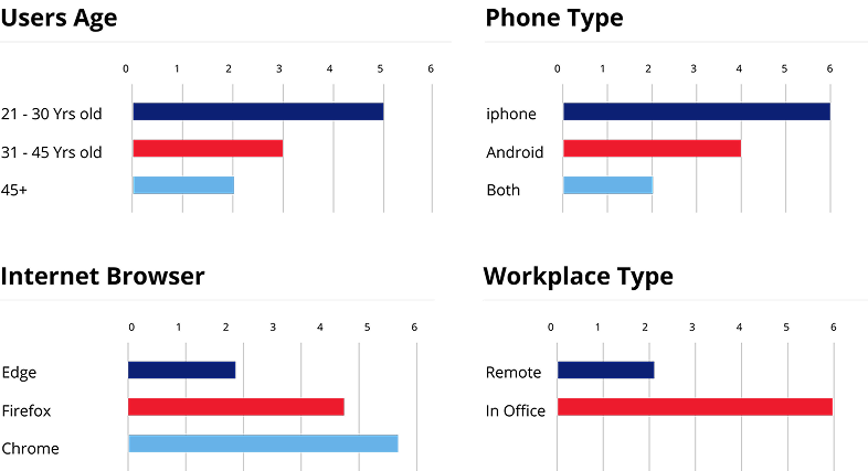
Participant Demographics

Conducted user interviews and workflow observations with 3 users.

Conducted User
Research

Research

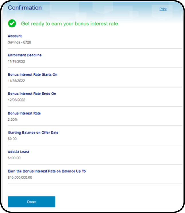
Research focused on how customers understood Balance Bonus eligibility, tracked qualification progress, and identified the actions required to complete the program.
Augmented Research

Ideation

Ideation/ Mind Mapping

Binoculars user phishing

Objective

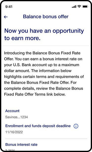
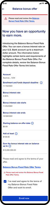
Create a clearer Balance Bonus experience that helps customers understand eligibility requirements, track progress, and identify the actions needed to qualify.


Corporate worker

Existing Problem

  • Qualification requirements were difficult to understand
  • Progress was not clearly visible
  • Important actions were spread across multiple screens
  • Key information lacked clear visual hierarchy

Security cooperation

Competitors

U.S. Bank competitors include PNC, Wells Fargo, Bank of America, M&T Bank and BB&T Corporation.

Binoculars

Research

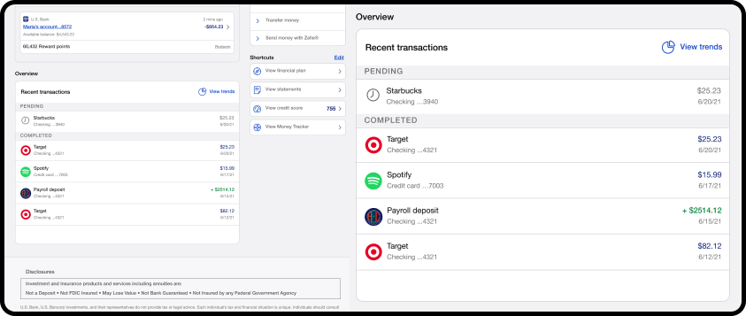
User feedback highlighted the need for quicker access to account activity, clearer qualification status, and easier access to actions related to Balance Bonus progress.

Computer user

Reusability

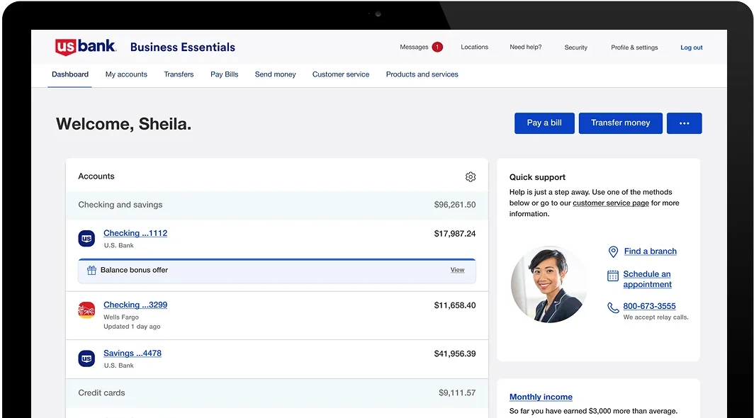
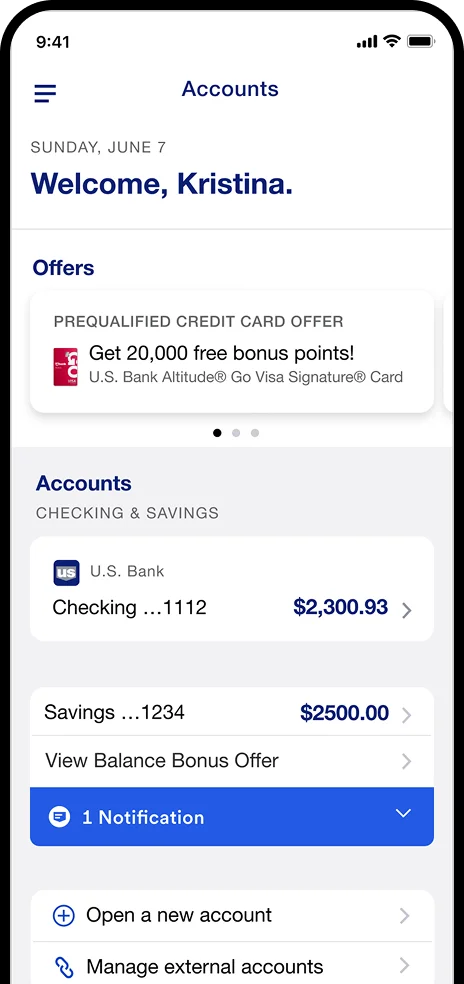
Reusable shortcut patterns, card layouts, spacing, and typography were applied to create a more consistent experience across desktop and mobile.

Ideation & Design Process

Carbon ibm process mining

Design Process

We followed a human-centered, iterative process of research, synthesis, ideation, prototyping, and validation.

Clarity process on vm line

Key Iterations

The experience evolved from scattered account information into a more action-oriented design that brings qualification progress, outstanding requirements, and relevant next steps into one clear view.


Wall Bg
Carbon business processes

Final Design Decision

The final direction prioritized clear progress visibility, simplified navigation, and consistent interaction patterns so customers could quickly understand their status and take the next required action.

Hugeicons package process

Tools

We used Figma for design and prototyping and FigJam for collaborative workshops, which enabled real-time feedback and a single source of truth.


05

AI Features

AI Features

AI Feature

Binoculars phishing

Enhanced Security

AI-assisted monitoring helps identify unusual account activity, strengthen protection, and provide customers with clearer security awareness.

File

Account Monitoring

AI can surface important account activity, highlight relevant updates, and help customers understand changes that may affect their Balance Bonus status.

Smart Rewards

Smart Rewards

Personalized insights can highlight relevant opportunities, completed requirements, and actions that may help customers make better use of available rewards.
Alerts & Notifications

Alerts & Notifications

Timely alerts can notify customers when requirements are completed, when action is needed, or when important Balance Bonus updates are available.


06

User Flow

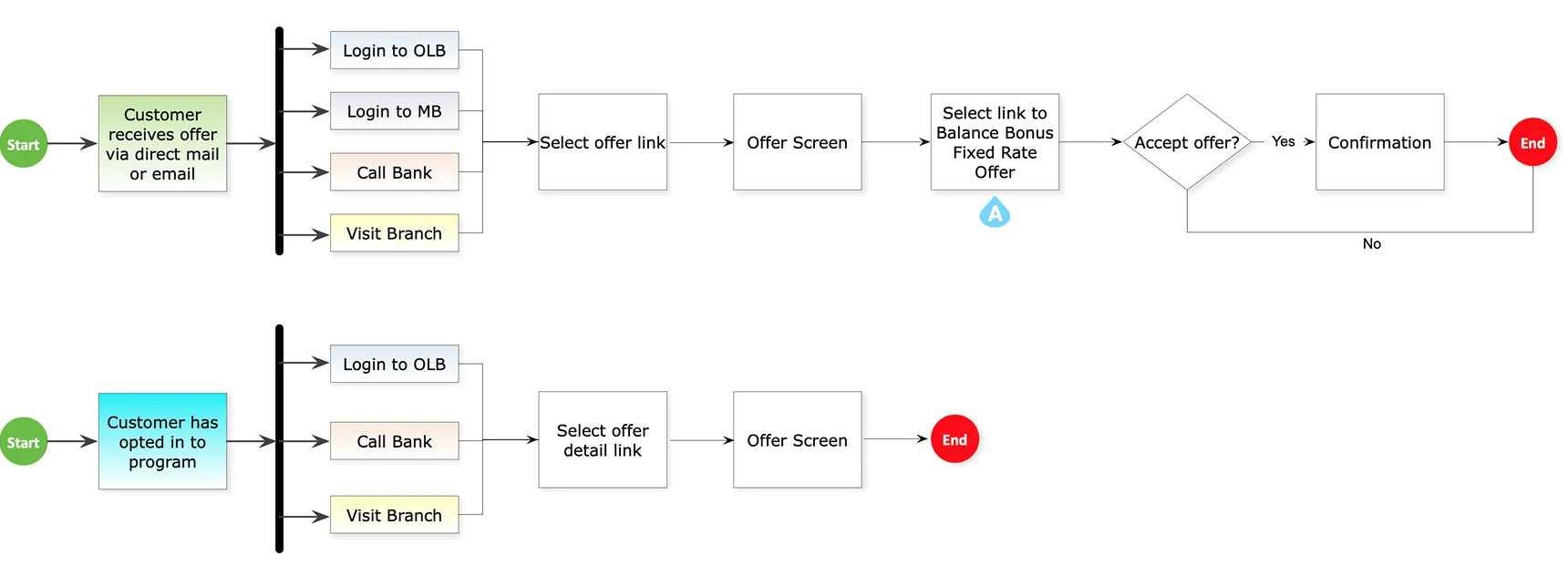
User Flow Section

User Flow

User Flow Img
07

User Interface

Early Concepts

Early Concepts

Early Concepts Image

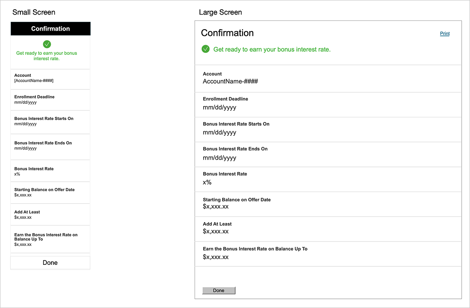
Final Visuals

Small Business Entry point

Small Business Entry point

OLB Entry

OLB Entry

OLB Entry

OLB Entry

OLB Un Rolled

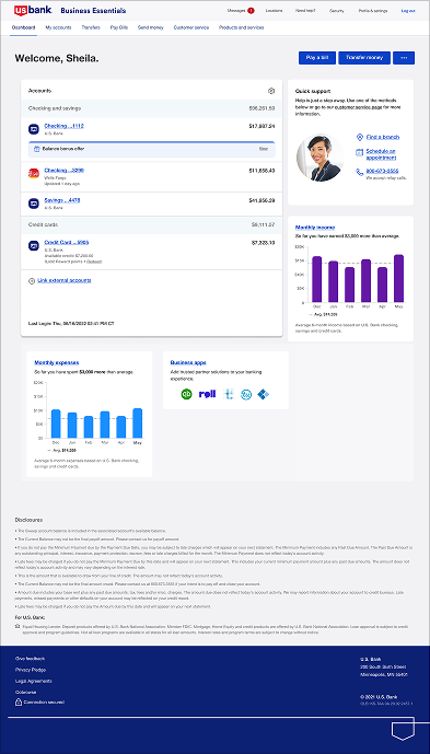
OLB Un-Rolled / Enrolled Dashboard

Mobile View

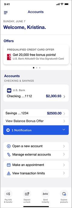
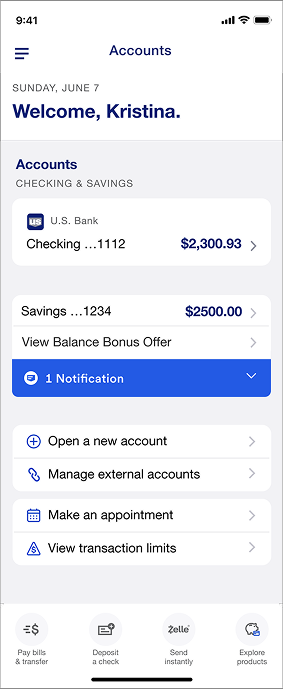
Mobile View

Mobile View
Mobile View
Mobile View
Mobile View
Desktop View

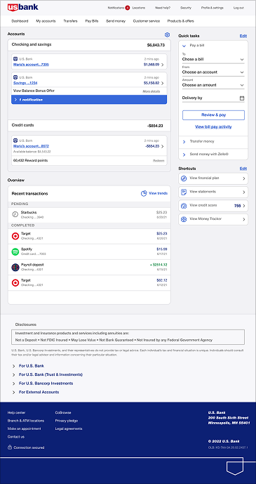
Desktop View

Desktop View
Desktop View
Desktop View
Desktop View
08

Core Accessibility

Core Accessibility Principles & Implementation

Core Accessibility
Screen Reader

Screen Reader Compatibility

Structure content with semantic HTML and ARIA labels so assistive technologies can interpret complex data and critical alerts.

Color

Color & Contrast

Use high-contrast colors and supplement color cues with icons/labels to ensure status is clear for all users, including those with color blindness.

Clarity

Clarity & Consistency

Maintain a predictable layout with clear language and multiple sensory cues to reduce cognitive load and prevent errors.

Keyboard

Keyboard & Focus

Ensure full keyboard navigation with clear focus indicators, so users can efficiently operate the dashboard without a mouse.

Handsoff

Collaboration & Handoff

  • Communication: I used interactive Figma prototypes and structured presentations to clearly articulate the user-centered rationale behind each design decision.
  • Documentation: Yes, I created detailed design specs in Figma with redlines, asset exports, and behavior notes for developers.
  • Handling Feedback: I facilitated collaborative workshops to align on user-centric goals, using data from research to resolve conflicting opinions objectively.
  • Ensuring Implementation: I held regular developer handoff meetings and used the shared component library in Figma Dev Mode to maintain design fidelity.
  • QA & Reviews: Yes, I actively participated in QA to check for visual/functional bugs and conducted post-launch heuristic reviews to track design debt.

Outcomes & Impact

Outcome: The redesigned experience made Balance Bonus requirements easier to understand and gave customers clearer visibility into qualification status and progress.

Improvement: The updated flow simplified navigation, improved information hierarchy, and made important account actions easier to identify and complete.

Measurable Results: Usability feedback showed fewer navigation issues and stronger understanding of progress, requirements, and next-step actions across key screens.

Do Differently: With more time, I would have expanded testing across different customer segments and explored more personalized guidance based on account activity.

Influence: The project introduced reusable patterns for progress tracking, status visibility, and responsive account interactions that could support similar banking experiences.

09

Annotations

Annotations

Annotation Keys

OLB/Mobile Annotations

Annotation
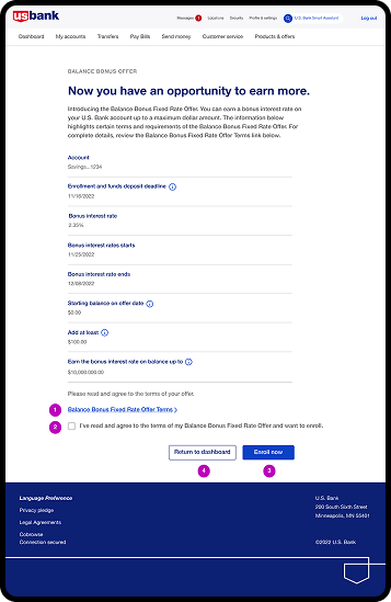
AB Annotations

Annotations

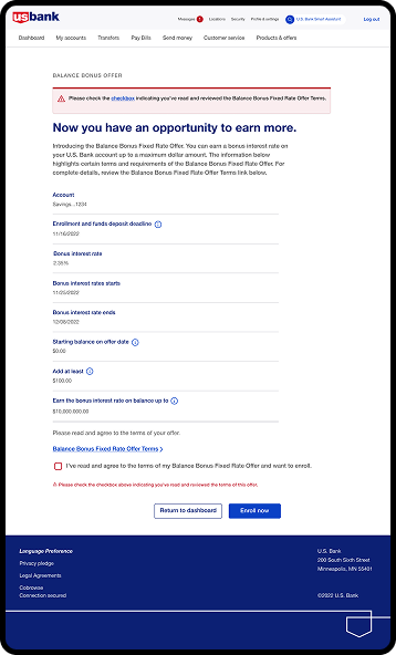
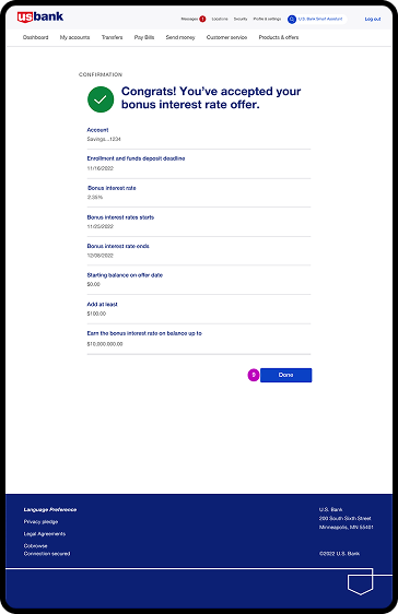
Retail dashboard enrollment

Annotation Keys

OLB/Mobile Annotations

Annotations
Annotations
Annotation
10

Prototyping

Realistic Experiences, Fast

Check the Prototype, it make easy to share high-fidelity, no-code, interactive experience. 

Experience New
11

User Testing

User Testing

Usability testing focused on how easily users could navigate the experience, understand key information, and complete important Balance Bonus-related tasks.

Griselda

Griselda J. Maxwell

  • Issue: Touch targets like buttons and links are too small, which makes them hard to tap, especially on small screens.
  • Solution: We increased the size of touch targets so they are easier to reach and tap.
Jed S. Newlon

Jed S. Newlon

  • Issues: Unclear navigation paths or buried features
  • Solution: Simplify navigation by organizing content hierarchically and using clear labels and icons. Implement a navigation structure that follows standard design
Michele J. Austin

Michele J. Austin

  • Issues: Inconsistencies in design elements such as colors, fonts, and button styles can confuse users and make the app feel unpolished.
  • Solution: We establish and adhere to a cohesive design system that governs the use of colors, typography, icons, and other visual elements.
Users Testing
12

Evaluation

Existing Screens

Existing Screens

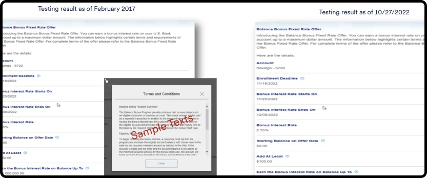
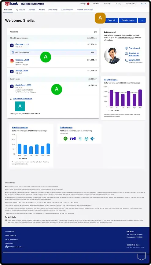
Inefficiency: Important qualification information required too many steps to access, making progress harder to understand at a glance.

Visual Hierarchy: Key actions and status information lacked clear prioritization across the existing experience.

Existing Screen
UI Screens

New UI Screens

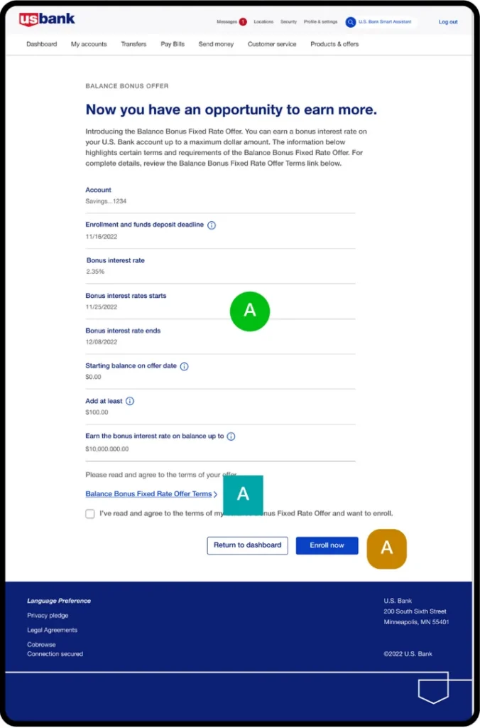
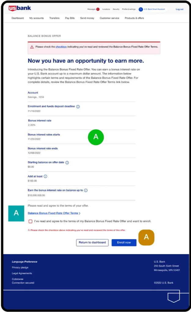
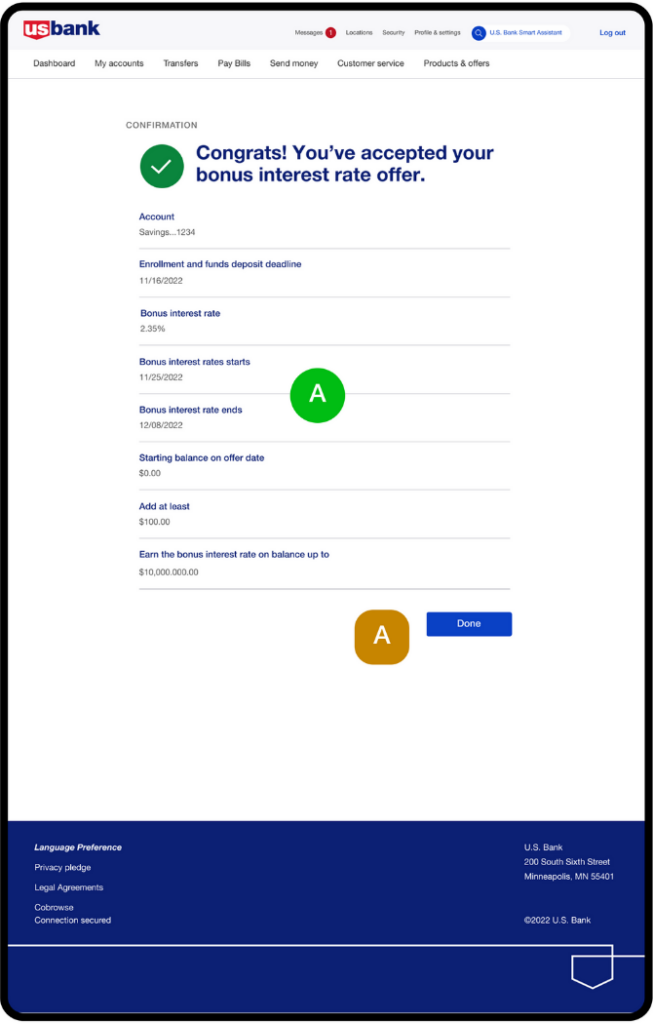
Modern design: The updated interface presents Balance Bonus information with clearer hierarchy, stronger visual consistency, and easier-to-understand progress states.

Improved efficiency: Simplified navigation and clearer information help users reach important actions with fewer steps and less effort.

Reflection Slide

Reflection

Valuable Insight

Valuable Insight

Shaking hands

From “Inefficiency” & “Improved Efficiency”: User workflows are a key material of design. We do not just design screens; we design efficient task flows. Reducing cognitive load and steps to complete a task were measures of success.

From “Outdated design” & “Modern design”: We learn that visual design is a powerful tool for building trust and engagement. An outdated aesthetic can erode user confidence in the system itself, while a modern, professional interface reinforces a positive brand perception and makes the system feel more reliable.

The Ultimate Insight: This project showed that a strong financial experience needs clarity as much as good design. Users should see status, done steps, and next actions without looking across many screens. Clear progress, simple paths, shared rules, and timely feedback reduce doubt and build trust.

The best choices made key details easy to find, understand, and use. The final experience linked account activity, qualification progress, and next steps into a smoother Balance Bonus journey that felt clear, focused, useful, and more trusted.

Thank You Badge

Thank You

To Connect with Us.

Wanna collaborate?

Let’s chat.

Name

(required)

Hey, thanks for checking out my work.

I’ve been fascinated with the way people interact with technology since forever. I’m particularly keen on digital products designed to make life easier for human beings.

What are you working on?

If you want to know more about my design process, or if you want to talk about a cool idea, don’t hesitate to hit me up.