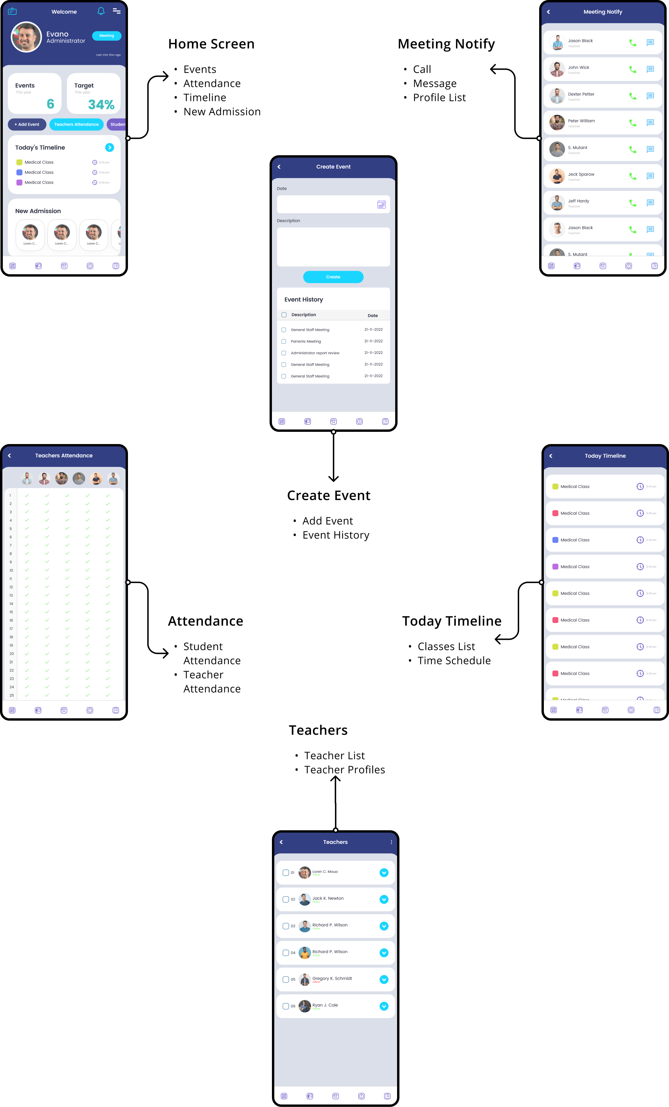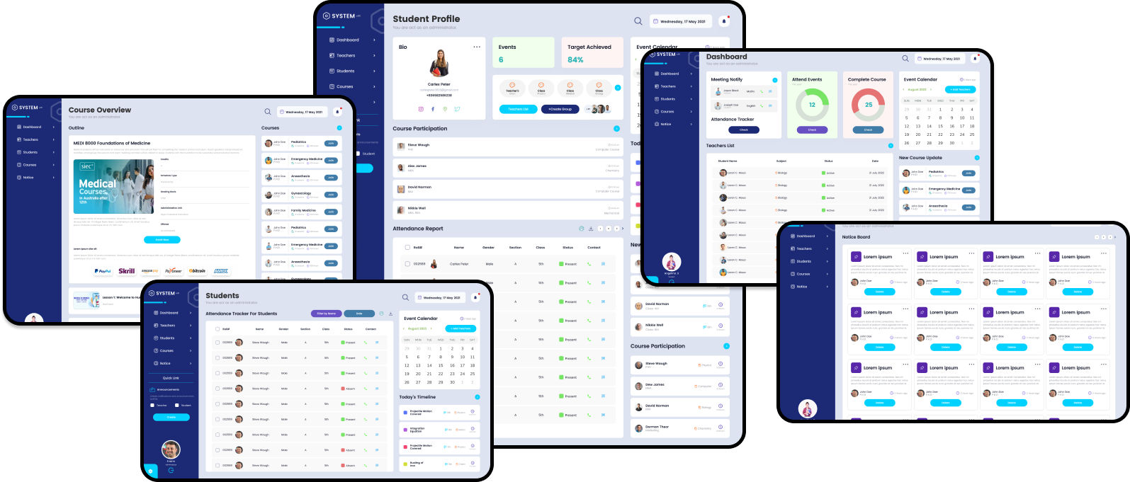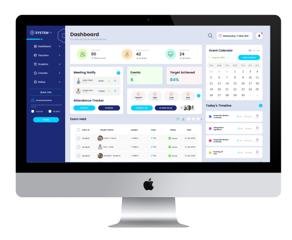
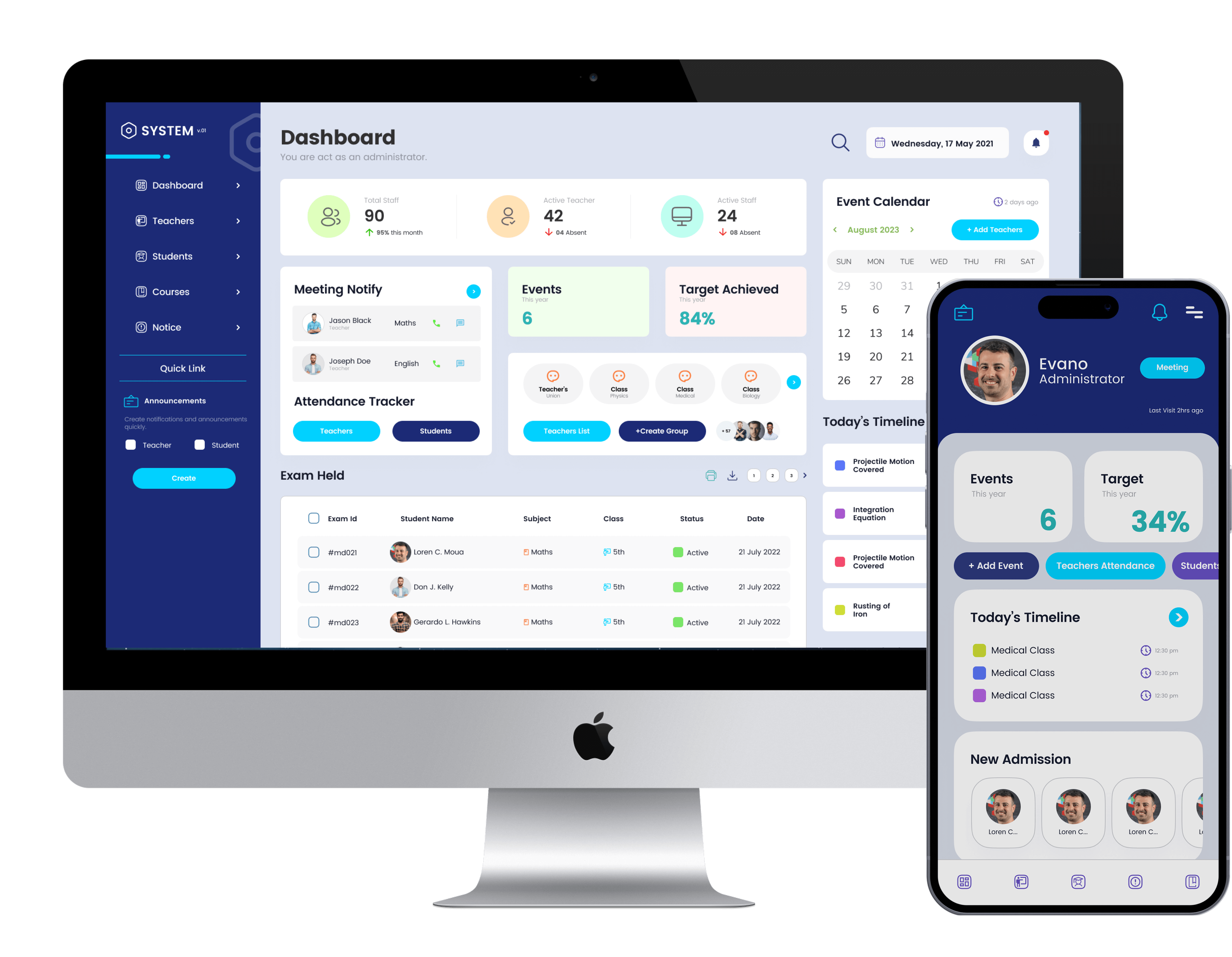



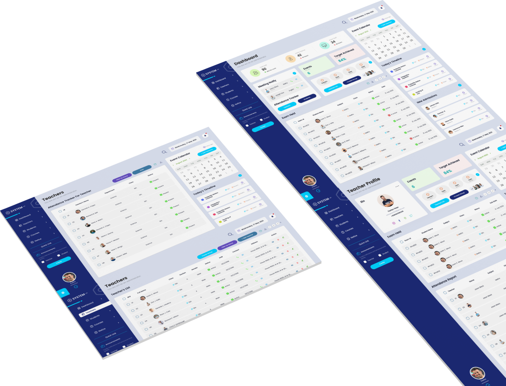

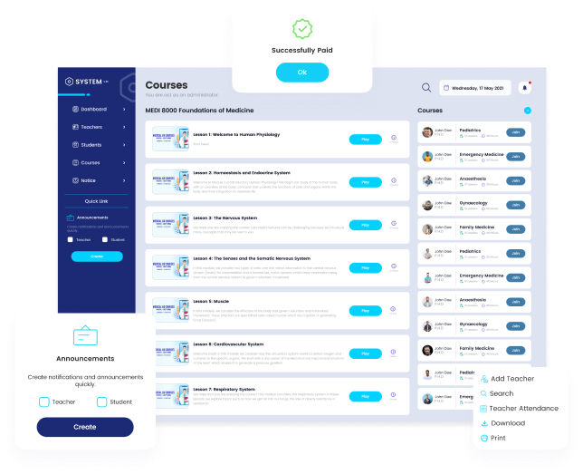
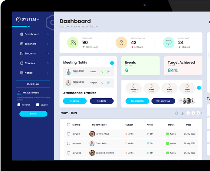







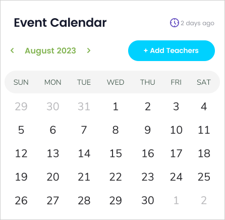
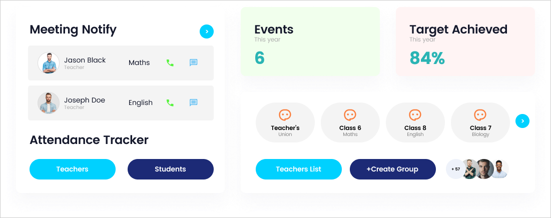











The Texas A&M Institute Management System was designed to simplify the management of student information, faculty records, attendance, fees and academic activities. Existing workflows relied on disconnected and manual processes, making routine administrative work time-consuming and difficult to manage consistently.
The platform brings registration, timetables, examinations, attendance and reporting into one structured experience. By organizing important information and creating clearer workflows, the system helps students, faculty and administrative staff complete common tasks with greater accuracy and efficiency.
This project was developed during my time at Texas A&M as an early-career exploration of how a unified digital platform could improve academic and administrative workflows. The system was designed for students, faculty members and administrative staff who needed easier access to institutional information and everyday tasks.
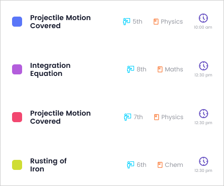
The experience supports student records, faculty information, attendance, fees, schedules, examinations and reports. Clear navigation and reusable interface components were introduced to help users locate information and complete important actions without moving between disconnected systems.
My goal was to create a practical and scalable management experience while strengthening my skills in information architecture, responsive interface design and complex workflow organization.
An institute management system addresses the core administrative and academic inefficiencies of educational institutions. Key problems include fragmented student data, manual attendance and fee tracking, poor communication between faculty and students, and cumbersome timetable and resource scheduling.
This disorganization leads to operational delays, administrative overhead, potential revenue leakage, and a diminished experience for all stakeholders—students, staff, and management—hindering the institute’s growth and educational quality.
Students, faculty and administrative staff needed a more consistent way to manage academic and institutional information. Manual processes and disconnected records made registration, attendance, scheduling, fee management and report generation slower and more difficult to maintain.
The design challenge was to bring these workflows into one understandable system while giving each user group access to the information and actions relevant to their responsibilities.
The existing experience depended heavily on manual recordkeeping for registration, attendance, schedules, examinations and reporting. Information was difficult to maintain across different processes, and administrative staff had limited visibility into current records and activities.
The challenge was to organize several complex modules within one platform without overwhelming users. The interface needed to remain understandable for students, teachers and administrators while supporting different permissions, tasks and information needs.
The scope of the system is to manage the student information, human resource and fees module.
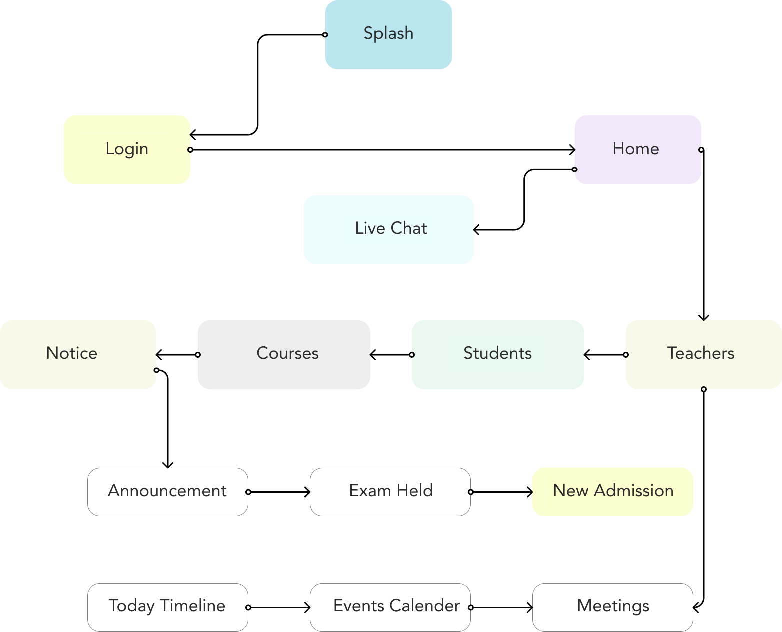
I began by identifying the primary user groups and mapping the academic and administrative tasks each group needed to complete. I then organized those requirements into system modules, created the information architecture and explored the main workflows through wireframes.
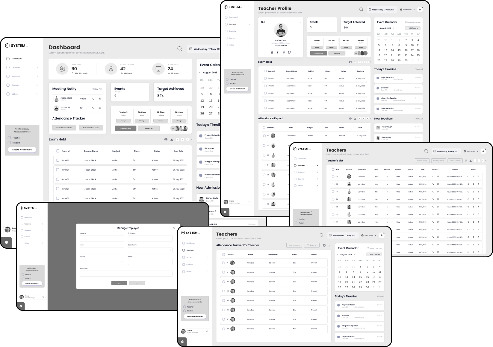
The design was refined across desktop and mobile layouts, with a focus on clearer navigation, consistent components and easier access to high-priority information.
The backend services would manage the data and logic of the app. This would include services such as user authentication, data storage, data retrieval, and data processing.
Overall, measuring the success of a school app requires a combination of quantitative and qualitative measures, as well as an understanding of the app’s goals and objectives.
User needs were explored across student, teaching and administrative workflows to understand where manual processes, fragmented information and repetitive tasks created the most difficulty.
Only call these people “interview participants” if real interviews were conducted. If the profiles are fictional or based on assumptions, change the heading from:

Matthews

Willson

Roods

Abraham

Newyork, USA

Name
Stephen David
Education
High School
Age
24 Years
Sydney, Australia
Name
Sara Wiliams
Education
High School
Age
22 Years

Frankfurt, Germany
Name
Stephen David
Education
High School
Age
21 Years

Newyork, USA
Name
Johnson Smith
Education
M.S.C
Age
36 Years
Sydney, Australia
Name
Angelina Williams
Education
M.B.A
Age
32 Years

Las Vegas, USA
Name
Sarah Johnson
Education
PhD
Age
52 Years
Sydney, Australia
Name
Aleza Moore
Education
M.B.A Marketing
Age
43 Years

Las Vegas, USA
Name
Gordon Brown
Education
P.M.P
Age
49 Years

Newyork, USA
Name
Hernandez .M
Education
M.S Supply Chain
Age
40 Years

Usability testing evaluated how easily students, faculty members, and administrators could navigate the system and complete essential tasks. The testing focused on navigation clarity, information accessibility, interface consistency, and the efficiency of key academic workflows.
Clear and consistent layout: The system should have a logical and intuitive interface that is easy to navigate.
Minimal learning curve: Users should be able to quickly understand and use the system without extensive training.
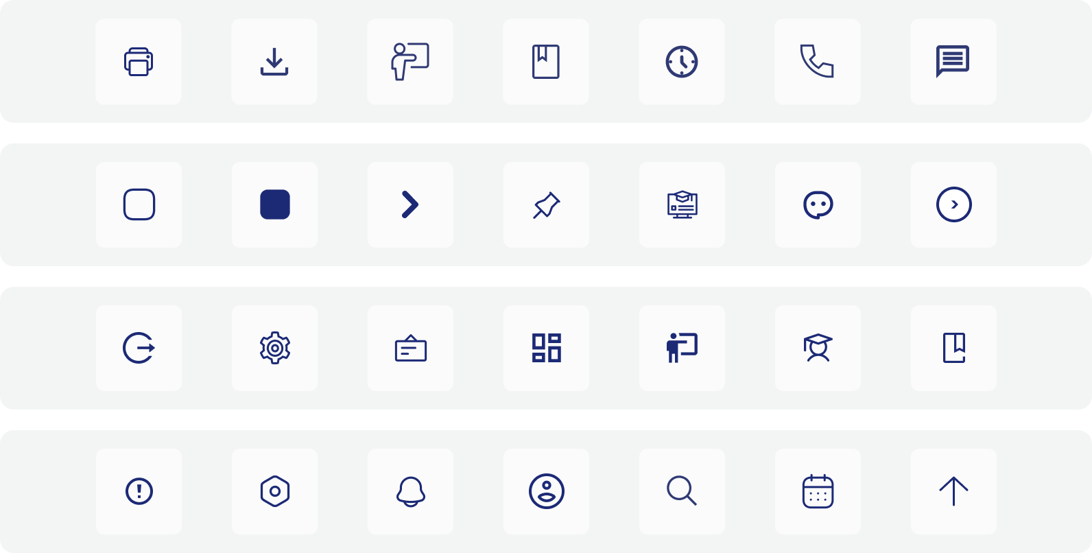
Visual cues: Effective use of icons, colors, and other visual elements can help guide users.
Automation of tasks: The system should automate repetitive tasks, such as attendance tracking, grade calculations, and report generation, to save time and effort.
Data accessibility: Users should be able to easily access and retrieve relevant information when needed.
Integration with other systems: The SMS should integrate seamlessly with other school systems, such as learning management systems (LMS) and accounting software, to streamline workflows.
Accessibility: The system should be accessible to users with disabilities, adhering to accessibility standards like WCAG.
Customizability: Users should be able to customize the system to their specific needs and preferences.
Responsive design: The SMS should be optimized for different devices, including desktops, laptops, tablets, and smartphon
This was an early-career project, so its primary value was the design experience rather than measured production results. It strengthened my understanding of information architecture, role-based workflows and designing complex systems for multiple user groups.
The project taught me that complex platforms cannot be improved by adding more features alone. The information must be organized around the responsibilities and priorities of each user.
If I revisited the project, I would conduct more structured usability testing with students, faculty members and administrative staff. I would also validate the most important workflows separately before expanding the system into additional modules.
Hey, thanks for checking out my work.
I’ve been fascinated with the way people interact with technology since forever. I’m particularly keen on digital products designed to make life easier for human beings.
What are you working on?
If you want to know more about my design process, or if you want to talk about a cool idea, don’t hesitate to hit me up.