Zafin bring an offer to keep our customers through higher interest rates. Creates one consistent view of product information across all channels (including deposit account interest rate disclosures and offer terms and conditions)
This project focused on designing a unified experience for managing relationship-based pricing across Zafin and US Bank systems.
The challenge was not simply improving UI—it was making a complex, multi-system pricing ecosystem understandable, efficient, and actionable for enterprise users.
A platform that enables financial institutions to:
The existing system was fragmented across multiple tools and workflows:
The core issue was not usability—it was lack of system clarity.
Users don’t just need better interfaces—they need to understand how data, rules, and outcomes connect across systems.
I designed a unified pricing experience that:
Problem:
Users navigated across multiple disconnected systems
Solution:
Impact:
Improved efficiency and reduced mental overhead
Problem: Users couldn’t understand how pricing decisions were derived
Solution:
Impact: Increased trust and reduced errors
Problem: Multi-step workflows were difficult to manage
Solution:
Impact: Faster task completion and improved usability
Problem: Users lacked confidence in outcomes
Solution:
Impact: Improved accuracy and decision confidence
Configuring Personalized Pricing
Goal:
Enable users to move from setup to execution with clarity and confidence
Design Decisions & Trade-offs
1. Information Overload
Initial designs surfaced too much data at once
Issue:
Users felt overwhelmed
Iteration:
2. Lack of Guidance in Complex Flows
Users needed more support during multi-step processes
Issue:
Increased errors and confusion
Iteration:
3. Weak System Feedback
Users were unsure if actions were successful
Issue:
Reduced trust and confidence
Iteration:

Unclear data visualization without proper explanations might leave users confused about their financial standing.

Small labeling on buttons can make it difficult for users to understand what each action does.

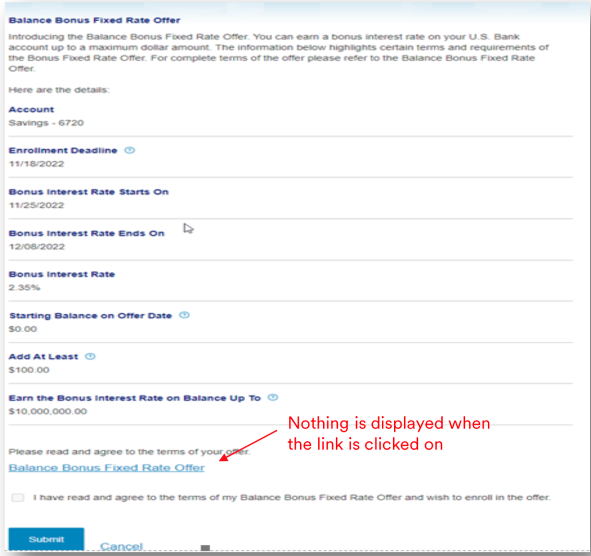
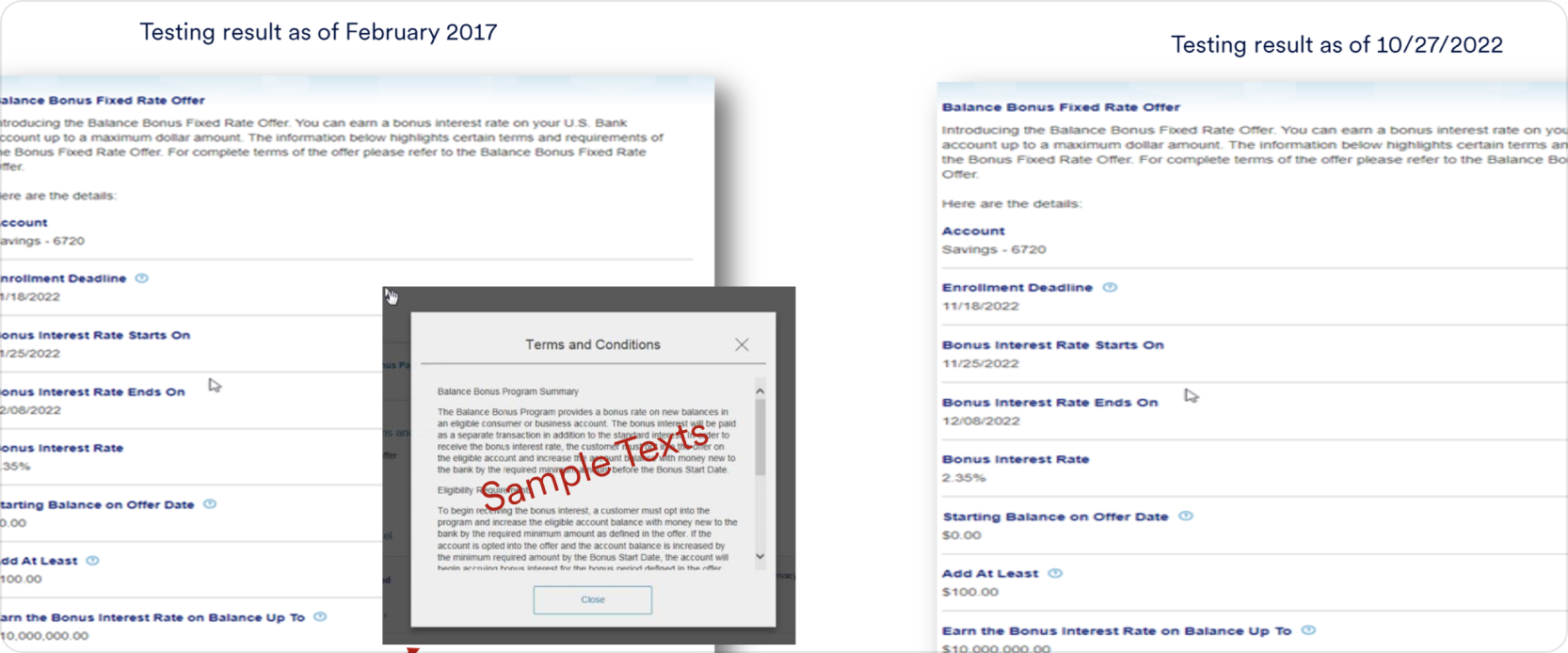
Some screens has confusing layout or lack intuitive navigation, making it difficult for users to find what they need quickly.

Slow loading times or crashes issues are frustrating and discourage users from relying on the app for managing their finances.


Design based on what already works.

Problem: Need quick access because long scenarios irritate us.
Solution: We add shortcuts to frequently used functions for easy one-tap access.

Problem: Balance bonus offer option is hardly needed.
Solution: View balance bonus offer option is placed in prompt location.

Problem: No any option added in last version, which is used to check quick bill activity.
Solution: View bill pay activity option is added like to check quick history.
Designing enterprise systems is not about simplifying features—it’s about making complex systems understandable and usable.
This project reinforced that:
Hey, thanks for checking out my work.
I’ve been fascinated with the way people interact with technology since forever. I’m particularly keen on digital products designed to make life easier for human beings.
What are you working on?
If you want to know more about my design process, or if you want to talk about a cool idea, don’t hesitate to hit me up.