Style Guides

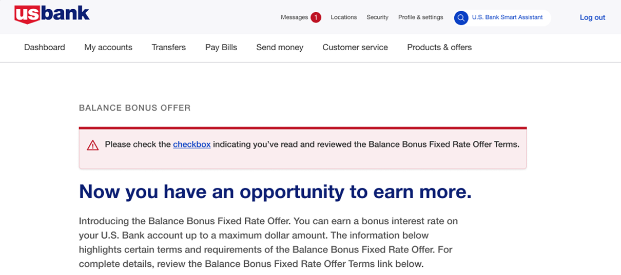
The goal was to create a unified design system for a suite of products to ensure a cohesive user experience, improve design efficiency, and maintain visual consistency across platforms (web, mobile, desktop). This design system needed to scale as the product offerings expanded and adapt to multiple platforms with ease.

Overview

A growing suite of digital products was being developed across web, mobile, and desktop platforms without a consistent visual language or shared component standard. Teams were repeatedly designing similar interface elements, creating inconsistencies across products and slowing the delivery of new features.

I helped establish a scalable design system that brought reusable components, visual standards, documentation, and usage guidelines into one shared framework. The goal was to improve consistency across products, reduce duplicated design effort, and give designers and developers a more efficient foundation for building and expanding digital experiences.

Sector

Design Systems

Challenge

The organization’s website needs to be redesigned to better connect with its audiences, including building a more intuitive information architecture and developing a coherent visual language.

My Role

Design Systems Architect — component library design, design governance, cross-functional stakeholder alignment, developer handoff specifications, adoption strategy.

Project Time

Ongoing since 2023 — initial system architecture and component library established over the first quarter, with continued governance and expansion across new interfaces since.

Challenges

Implementing any design system comes with challenges. However, there are unique challenges you’ll run into when scaling a design system to multiple teams and multiple websites.

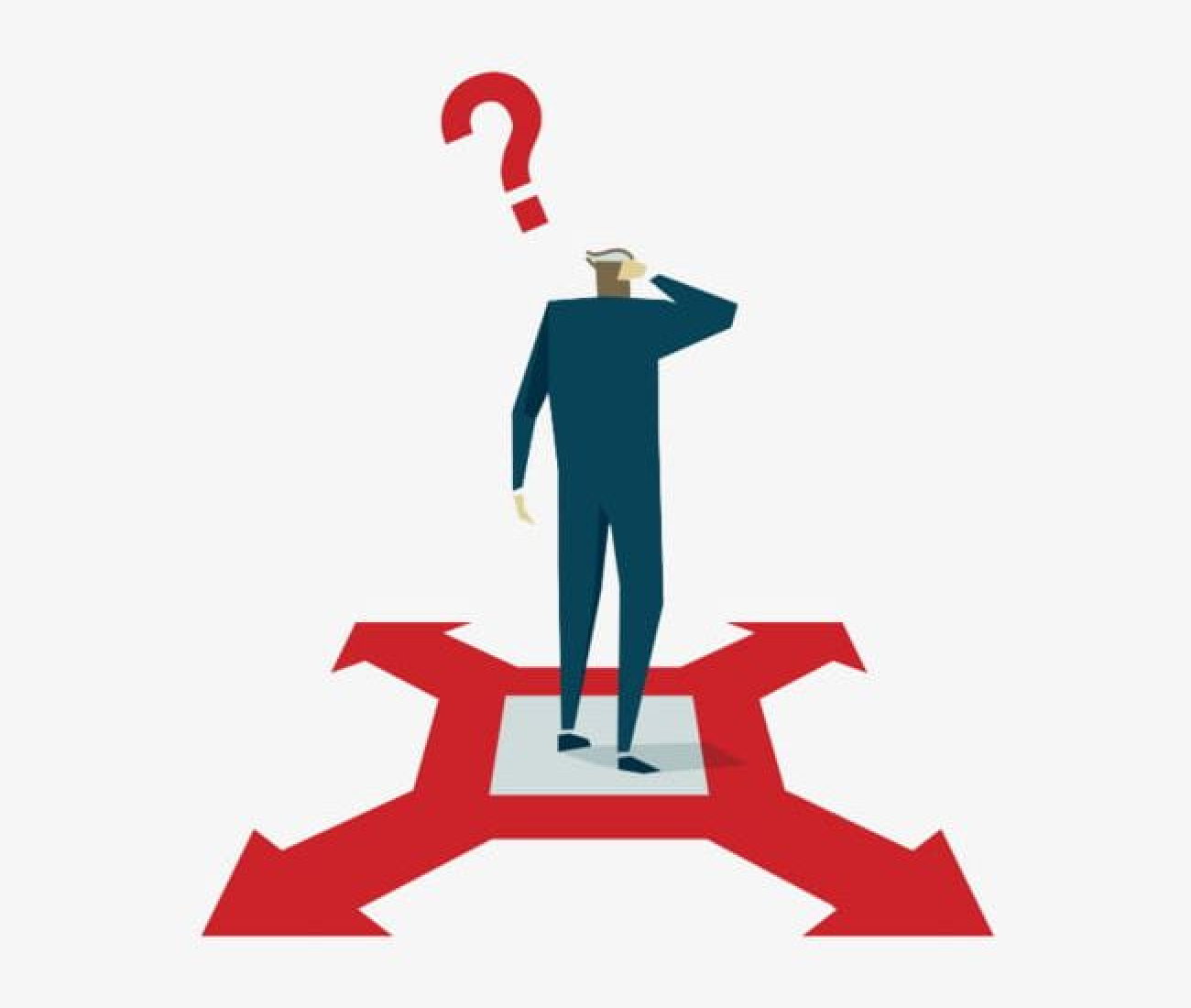
One of the biggest hurdles design system teams face is getting widespread adoption across their organization. You can create the most beautiful, well-thought-out design system in the world, but it’s worthless if developers aren’t actually using it.

Image
Image 782 (1)

Solutions

The key to solving the problem is to make integration as frictionless as possible for developers. Instead of asking them to become experts in your design system, provide tools that are already well versed in your preferences.

A better solution to all of this manual work is to use a design to code tool with design system support. This approach most effectively eases the learning curve and makes migration easier, significantly boosting adoption rates. Builder’s Visual Copilot is one example of such a tool.

Image 782 (1)

What's Inside

Image

breadcrumb

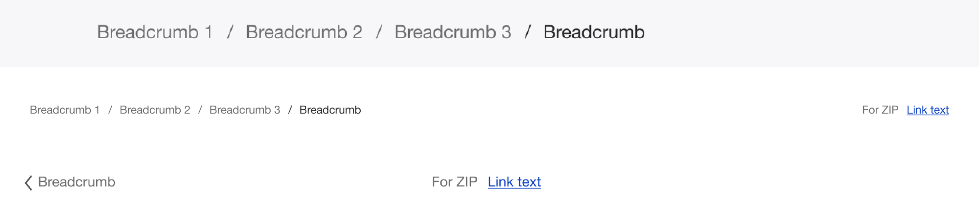
We enhance user experience with breadcrumb navigation. We used it as a secondary navigation scheme on the website, where visitors may want to go deeper into the site hierarchy.
Group

Cards Component

Cards are surfaces that display content and actions on a single topic. They should be easy to scan for relevant and actionable information.
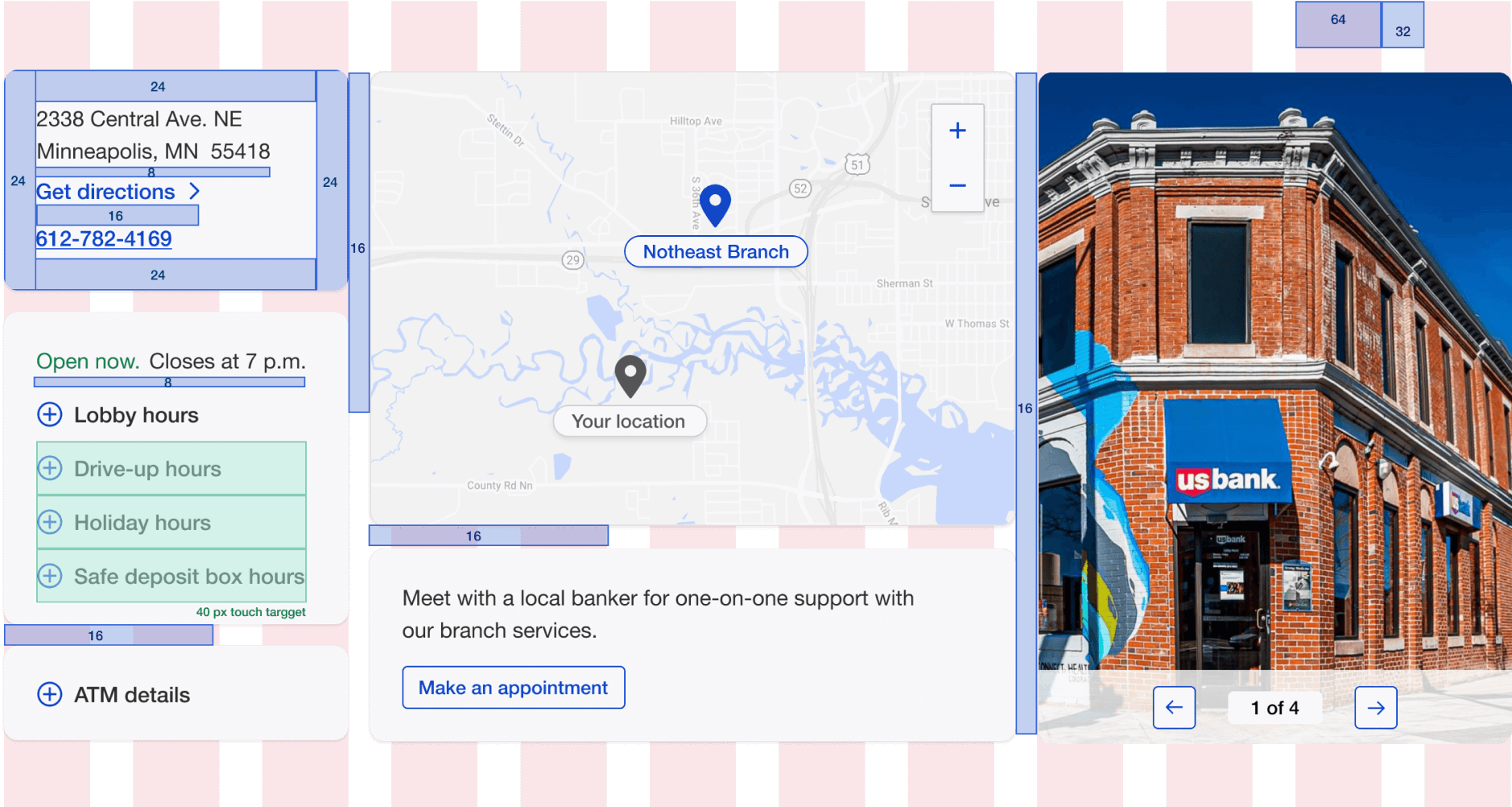
Standard Branch Page Layout
Image 767 (1)

Image Carousel

Also known as sliders, galleries, and slideshows, web carousels let you display text, graphics, images, and even video in one interactive, “sliding” block.
Image 767 (1)

Workflow Stepper / Progress Indicator

A horizontal step indicator used in multi-stage approval and reconciliation flows, showing users where they are in a process and what’s still ahead. Designed to handle both linear flows with a fixed number of steps and conditional flows where steps appear or disappear based on approval routing.
Offer (1)
Offer

Search & Filter

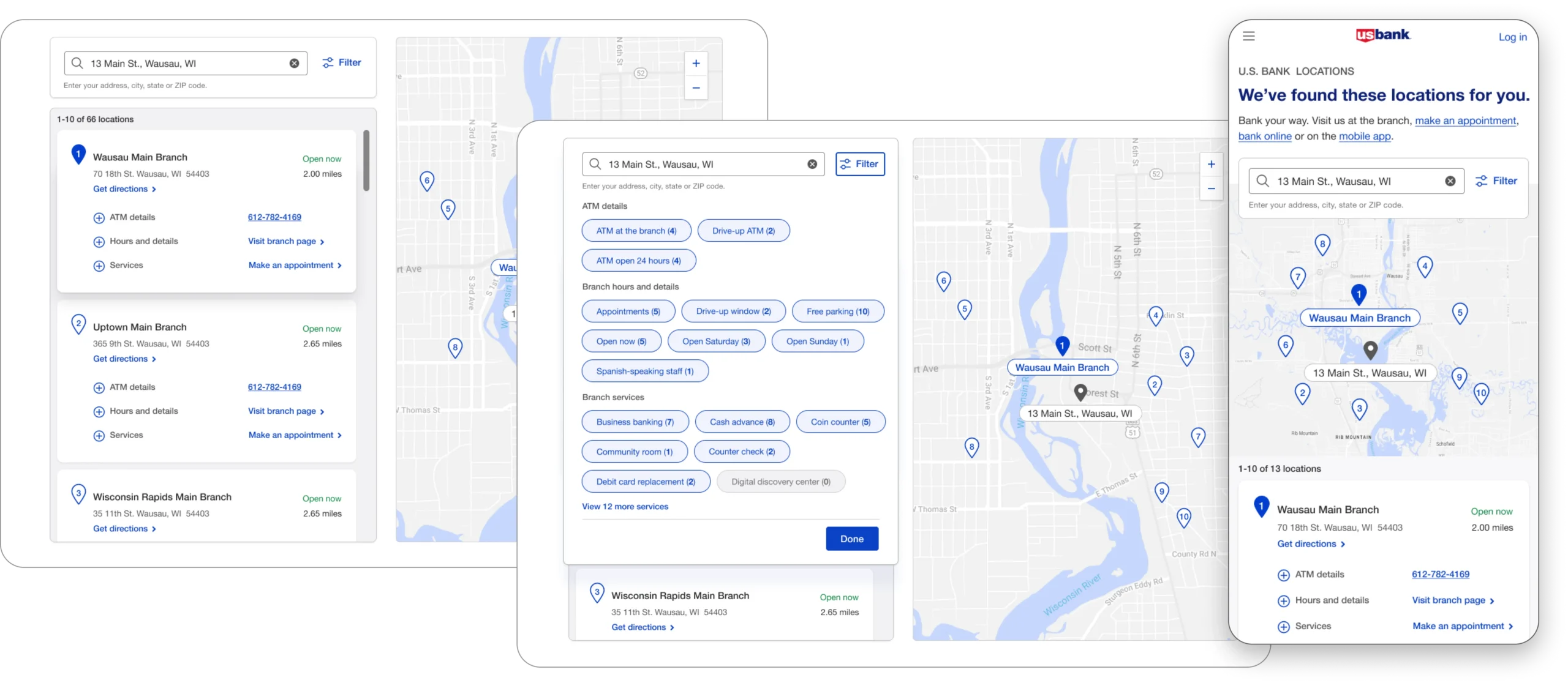
A single view that displays the search filters, results (formatted as you want, including as cards with the appropriate styling), and as markers on a map.
Group 52 (2)

Data Table

The most-reused component in the library, given how much of the workflow data across Built with sortable columns, inline status badges, and a fixed action column so users can act on a row (approve, flag, escalate) without losing their place in a long list.
Ta img1

Alert / Notification Banner

Used to surface time-sensitive workflow issues—a failed reconciliation, an approval nearing its deadline, or a data-sync error—directly in context rather than through a separate notifications panel users had to remember to check. Severity is color-coded using the same status logic as the badges above, so users only need to learn one color system across the product.
Design system alerts

Badges

A trust badge is a symbol or a small image placed on a website that aims to convince visitors that their personal data will be handled safely.
Image
Image
Image

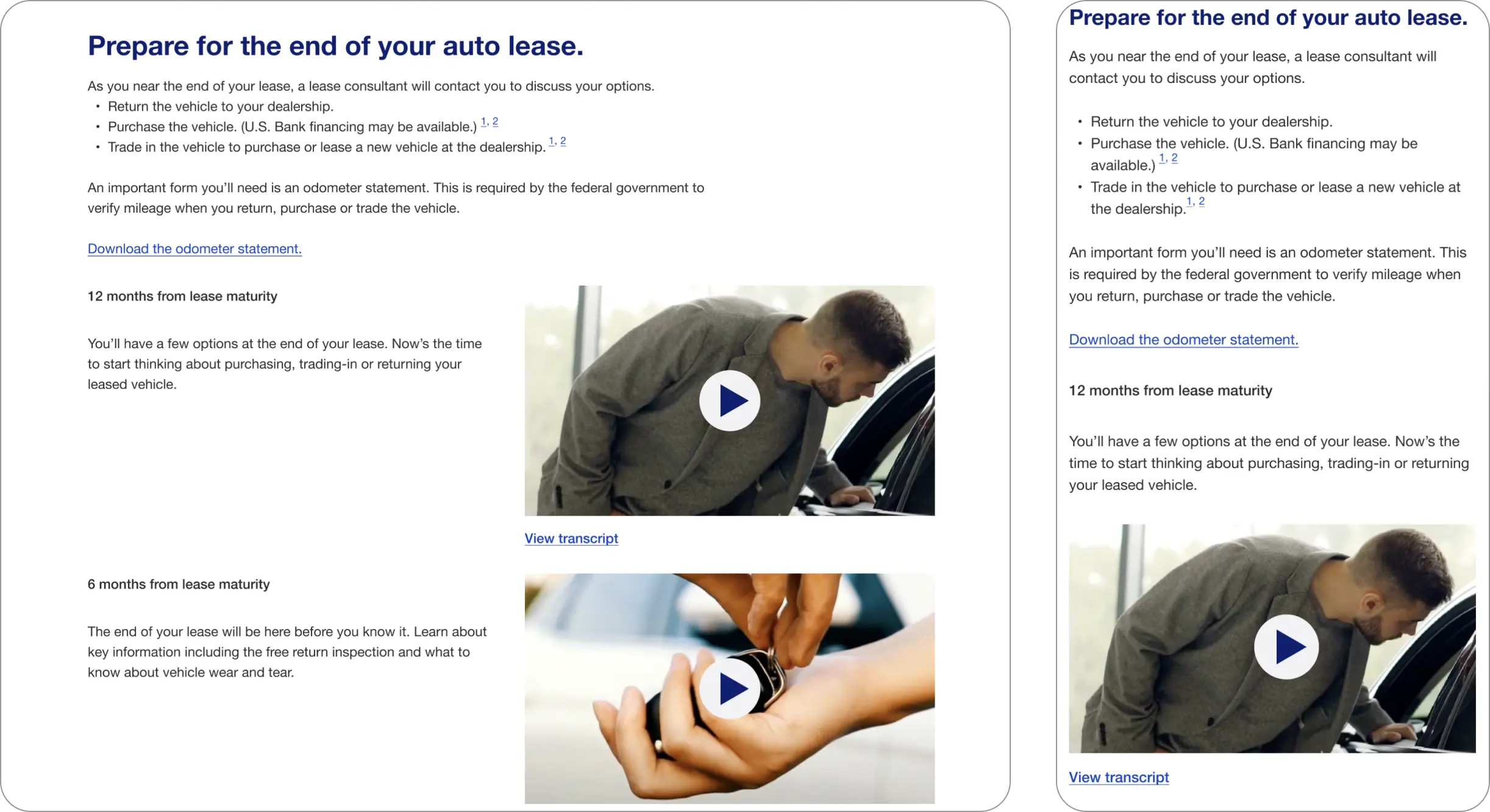
Video Player

An easy-to-use and very lightweight video player for website.
Group 53 (1)
Image 775 (1)

Data Visualization

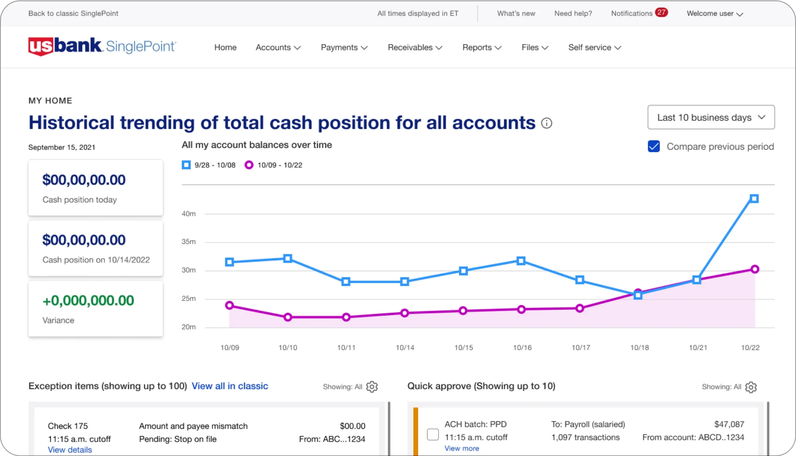
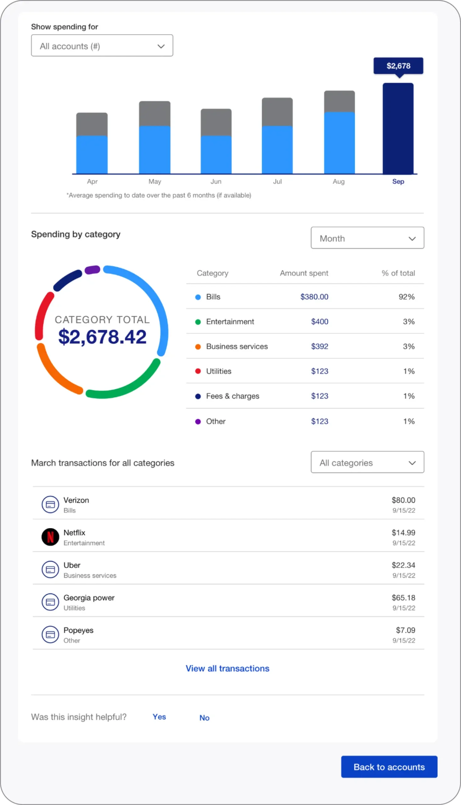
Data visualization form is a graphical representation that transforms complex datasets into a combination of understandable visuals.
Image 777 (1)
Image

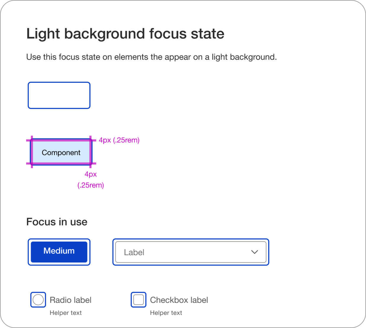
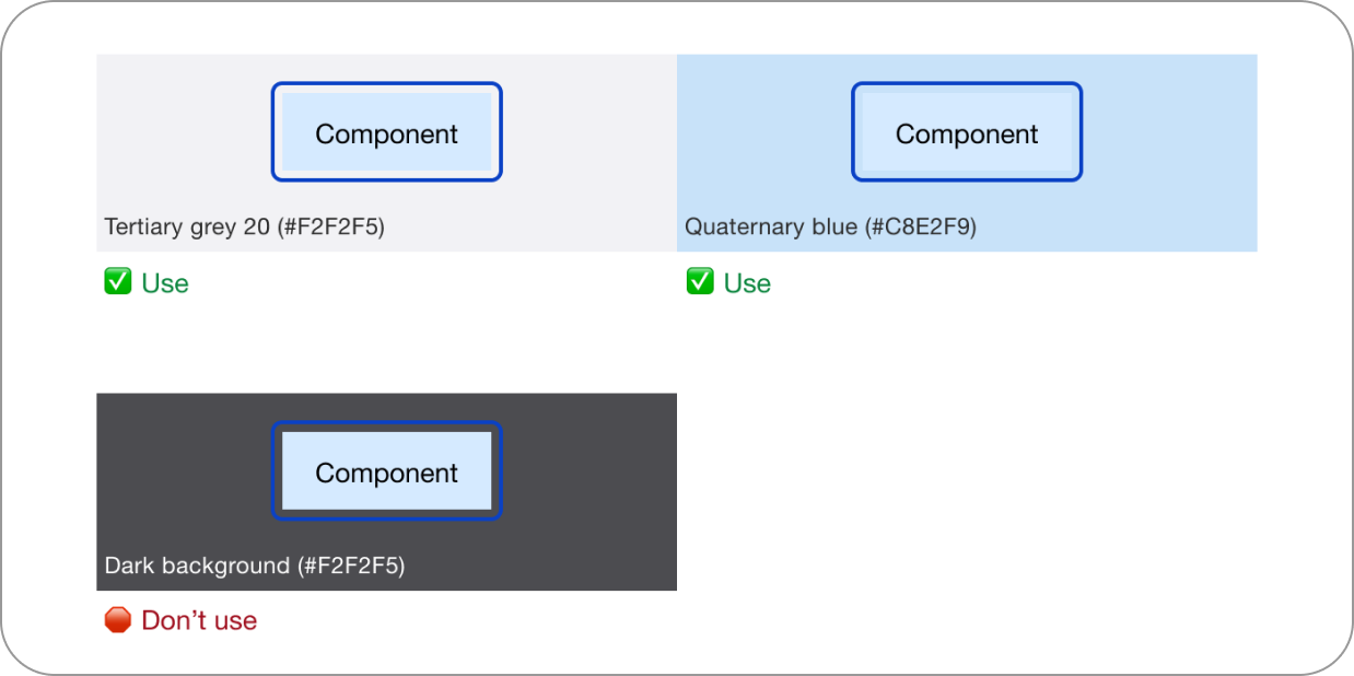
Focus State

Image
Image

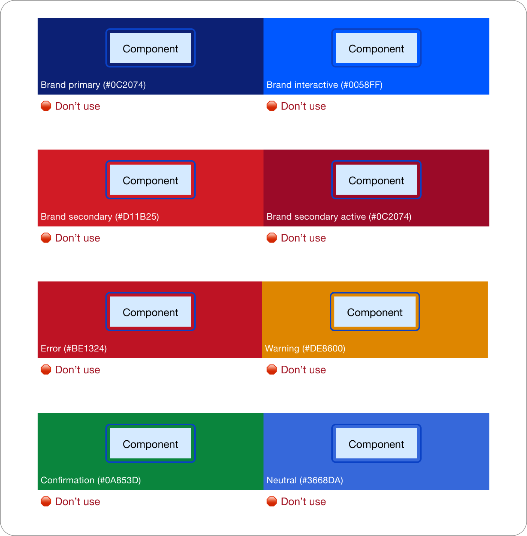
Colors

Image 780 (1)

Icons & Illustrations

Group
Group

Merchant Logos

Merchant logos play a crucial role in enhancing the credibility, trust, and overall user experience of a website. They serve as visual cues that instantly recognize brands and products, guiding customers through their online shopping journey.
Image

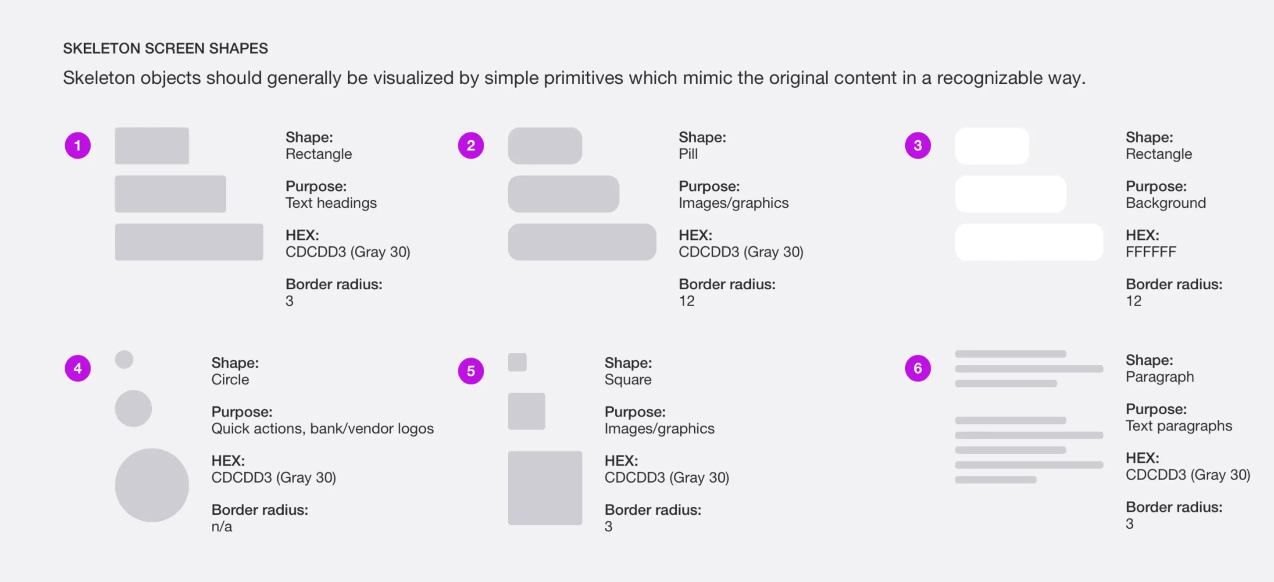
Skeleton Loader

A skeleton screen is an animated placeholder that simulates the layout of a website while data is being loaded.
Skeleton screens cover slide@2x (1)

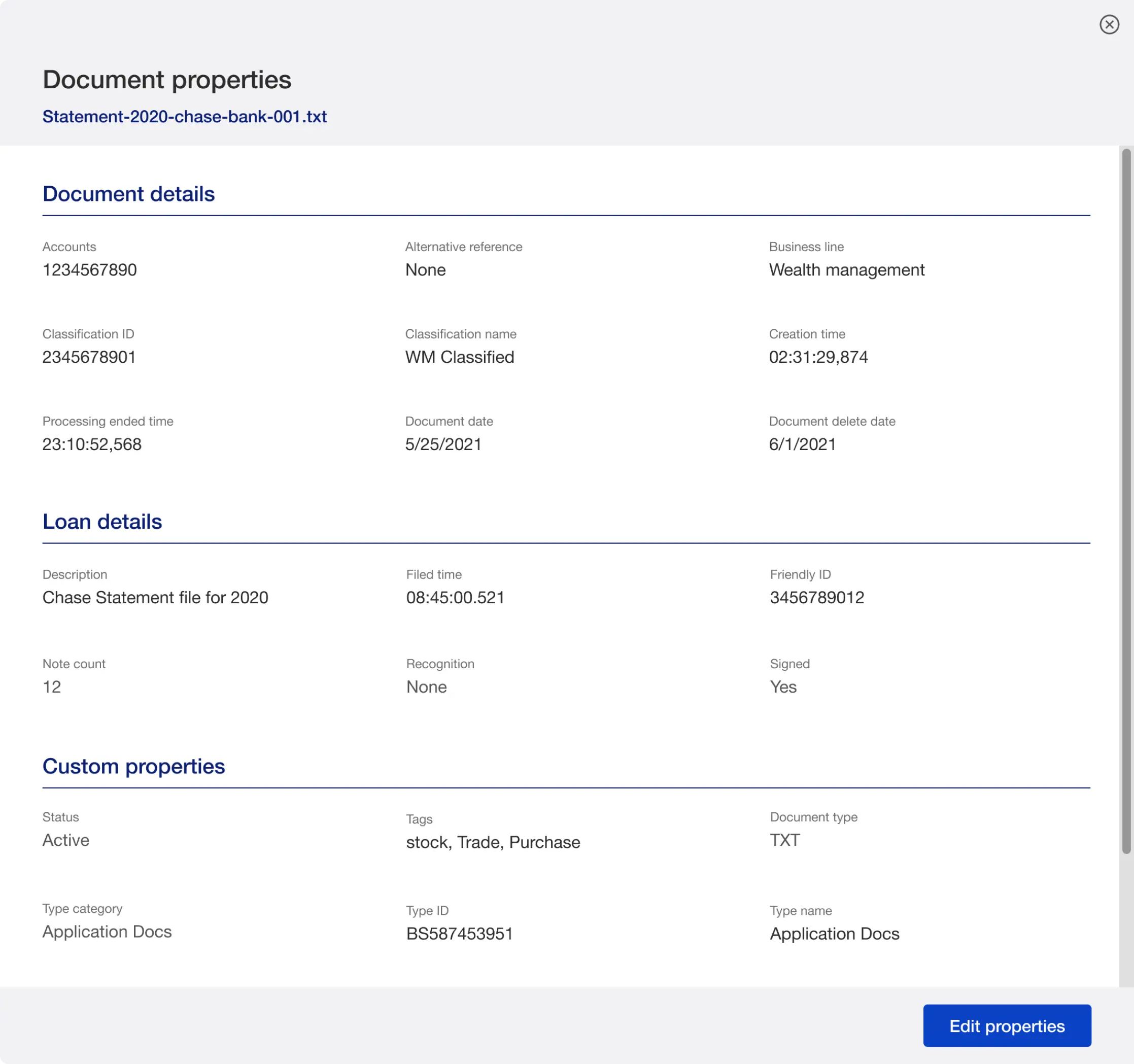
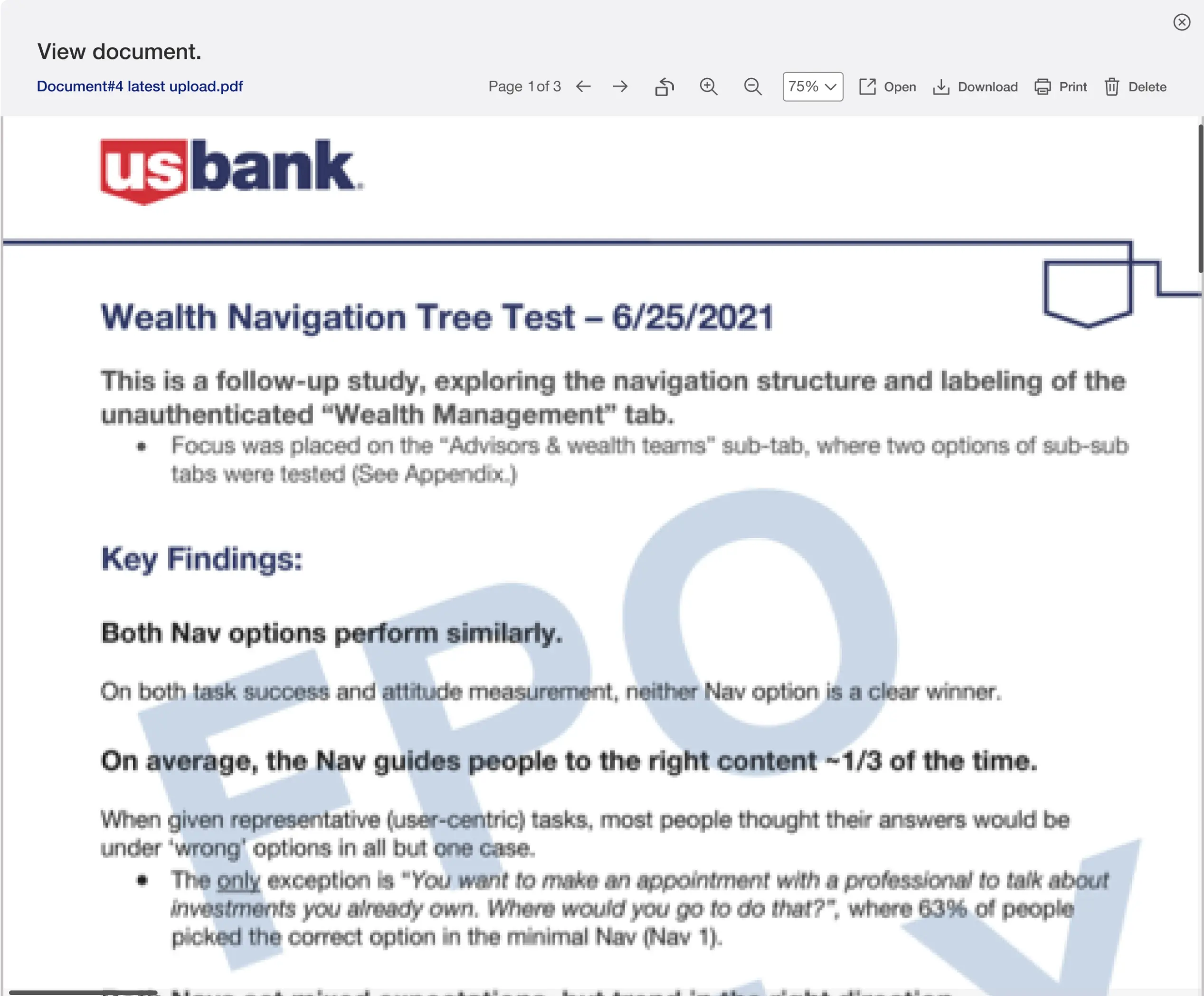
Modals

Modal is a pop-up that appears on a page and disables all other content. Here’s everything you should know about modals in web design.
Image
Image

Numeric Input

Numeric input is an input component that allows you to enter a numeric value to be treated as a number.
Numeric Input Community

Toggle Switch

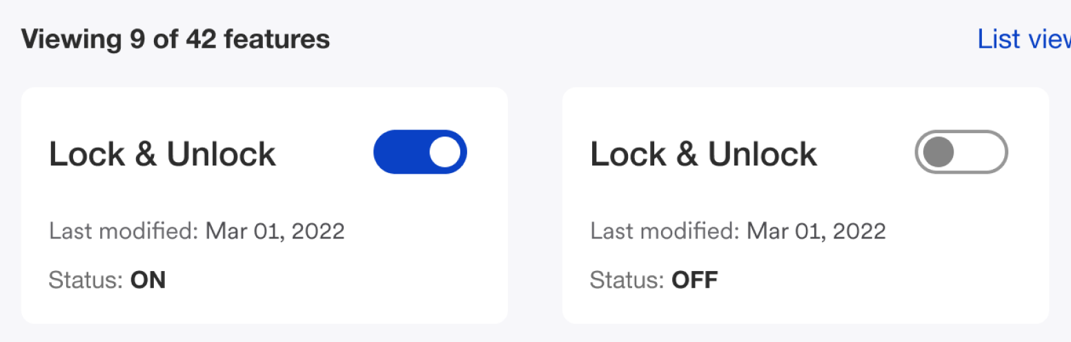
Toggle buttons indicate a state between an enabled or disabled state when the button is clicked.
Layout 31

What I’ve Learned

The hardest part of a design system isn’t building it — it’s getting people to use it once it exists. Early on, I assumed a well-documented component library would drive adoption on its own. It didn’t. Adoption only took off once the system was genuinely faster than building from scratch — when using it saved a team real time on their next deadline, not just theoretical time down the line. That shifted how I think about design systems work generally: governance matters, but usability for the builders, not just the end users, is what determines whether a system actually gets used.

Wanna collaborate?

Let’s chat.

Name

(required)

Hey, thanks for checking out my work.

I’ve been fascinated with the way people interact with technology since forever. I’m particularly keen on digital products designed to make life easier for human beings.

What are you working on?

If you want to know more about my design process, or if you want to talk about a cool idea, don’t hesitate to hit me up.