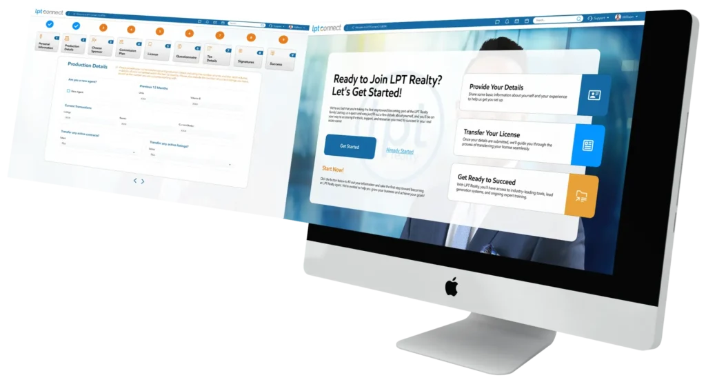
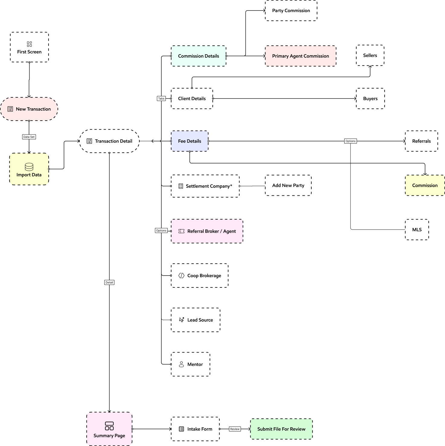
The LPT Connect Intake Wizard is an AI-powered digital onboarding tool designed to streamline the client intake process for agents and professionals. It automates form collection, enhances transaction details-client matching, agent commissions and ensures secure, compliant data handling—reducing administrative workload while improving engagement.
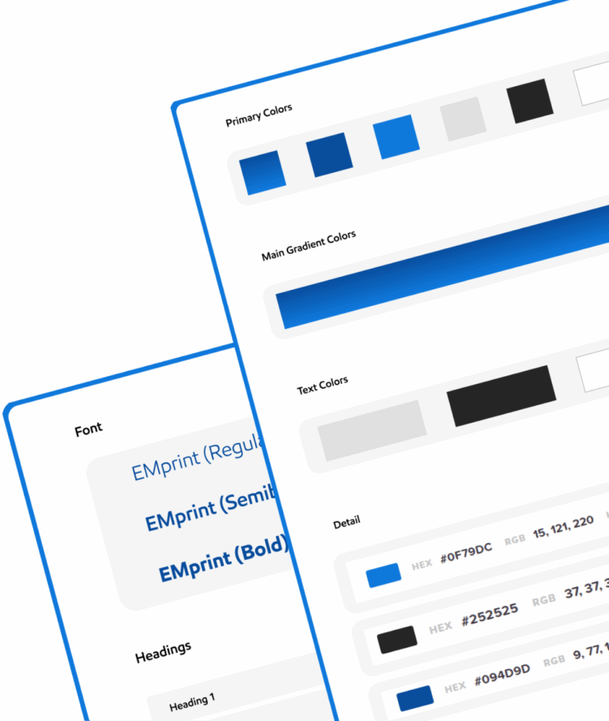
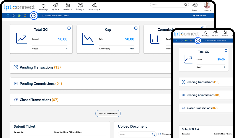


The overarching goal of the LPT Connect Intake Wizard is to revolutionize the transaction and agent commission intake process by eliminating administrative bottlenecks, improving and enhancing data security—all while delivering a seamless, user-friendly experience for both clients and providers.

Implemented a real-time Fee detail, agent commission and communication platform, providing instant notifications and updates to administration and agents..

Conducted interviews, surveys. and observations to gather qualitative data about the users.
The “Empathize” stage is the initial phase of the design thinking process, focusing on understanding the users needs, motivations, and challenges.

Offers a listing platform to find commercial properties.

Provider of real estate brokerage services for buying and selling residential & commercial property.

Real estate brokerage franchising.

Provider of brokerage services for commercial and residential properties.


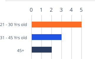
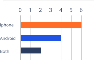


I learned about the users by creating detailed profiles called user personas, helping me understand their needs, goals and frustrations.

20
New York
24 Years
Sales Manager
Tech Sevy
Social Skills
Org Activity
Internet
Socialmedia
Online Shopping
Extrovert
Introvert
Thinking
Feeling
Aliza is a housewife and mother of a 2nd grade child who values education. Her days revolve around household chores and taking care of her child.


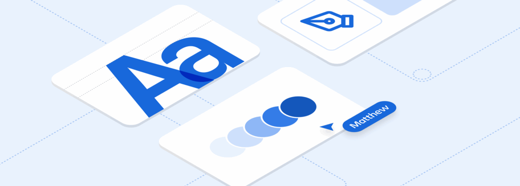


As I planned for the work of restructuring and documenting our components, I also started a campaign across PDE to educate on how design systems could support our product strategy goals.
To support this effort, I wrote an internal memo on our design system strategy, and followed up with regular updates on the team’s progress. This also supported the creation of a dedicated role in engineering to focus on design systems
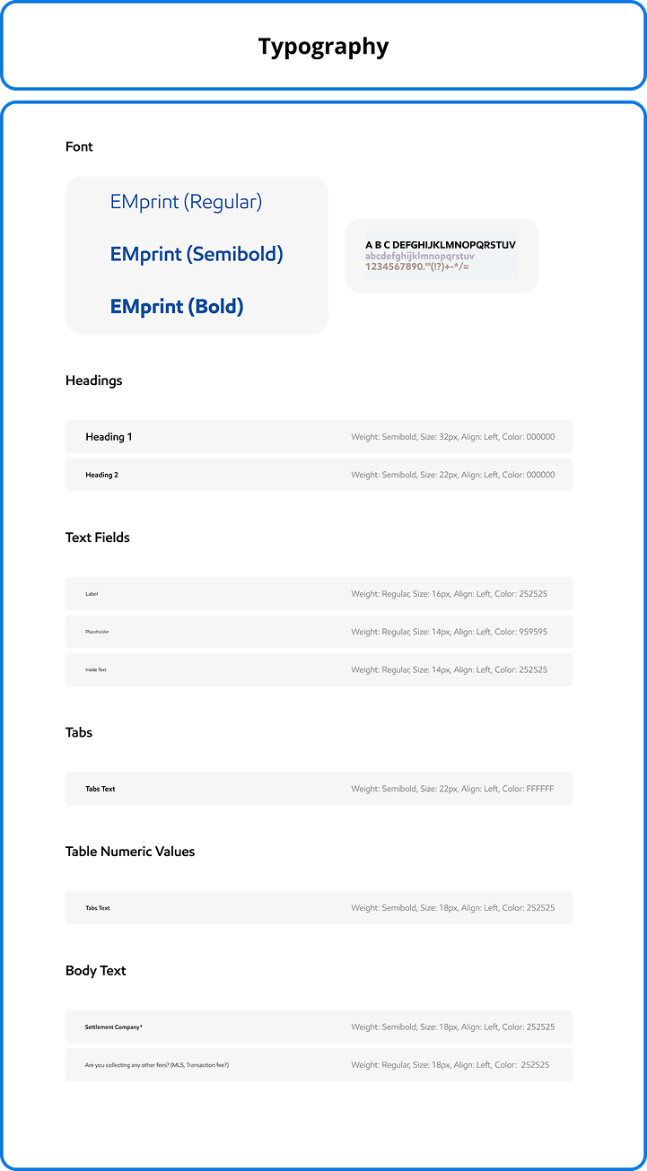
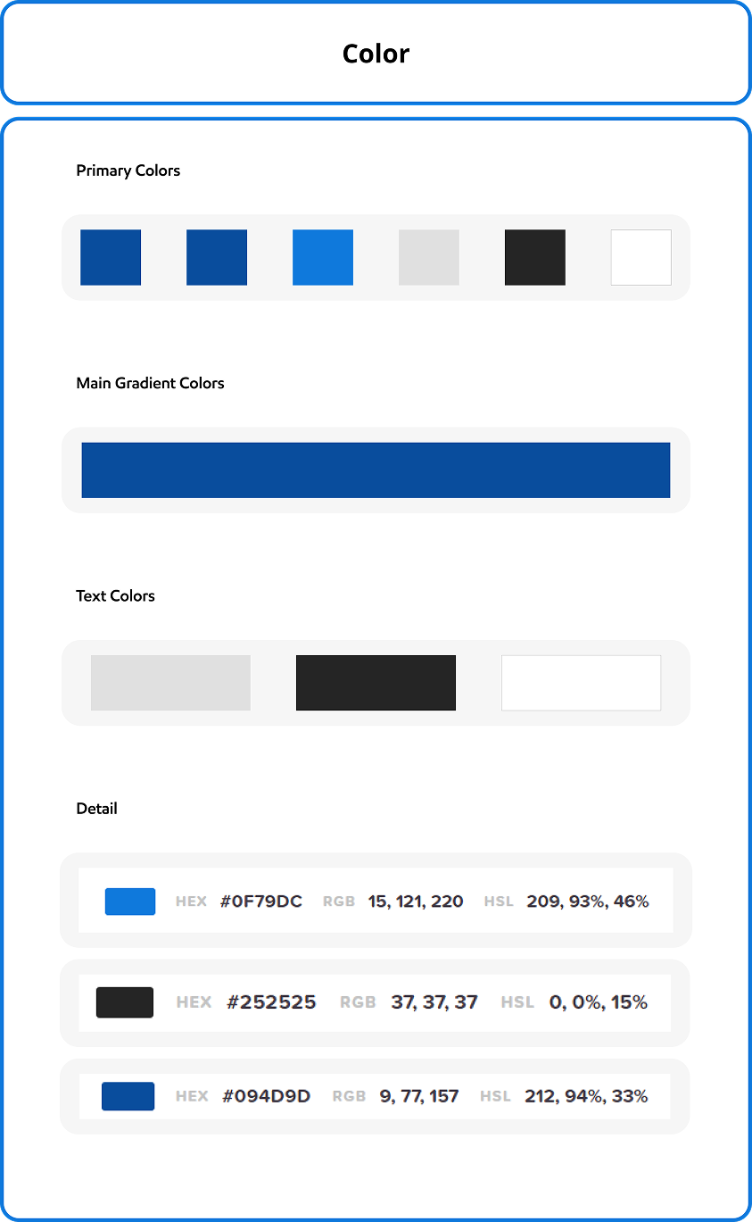
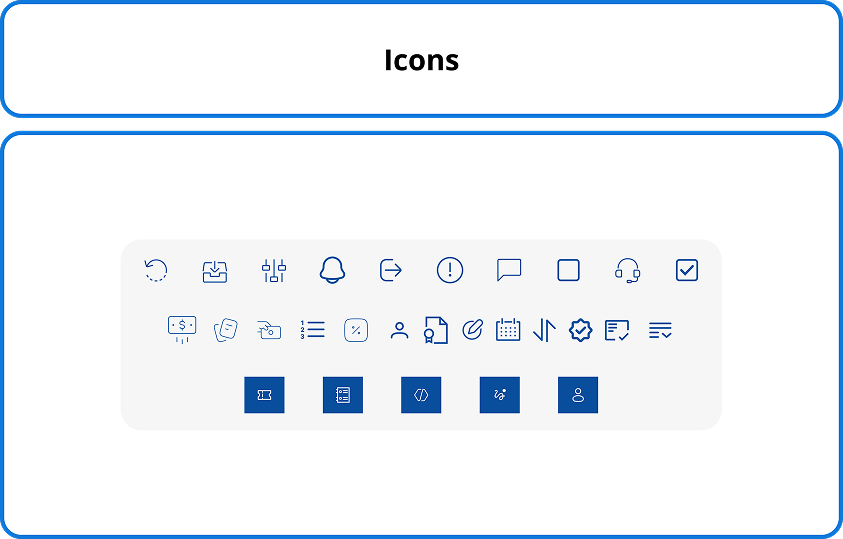
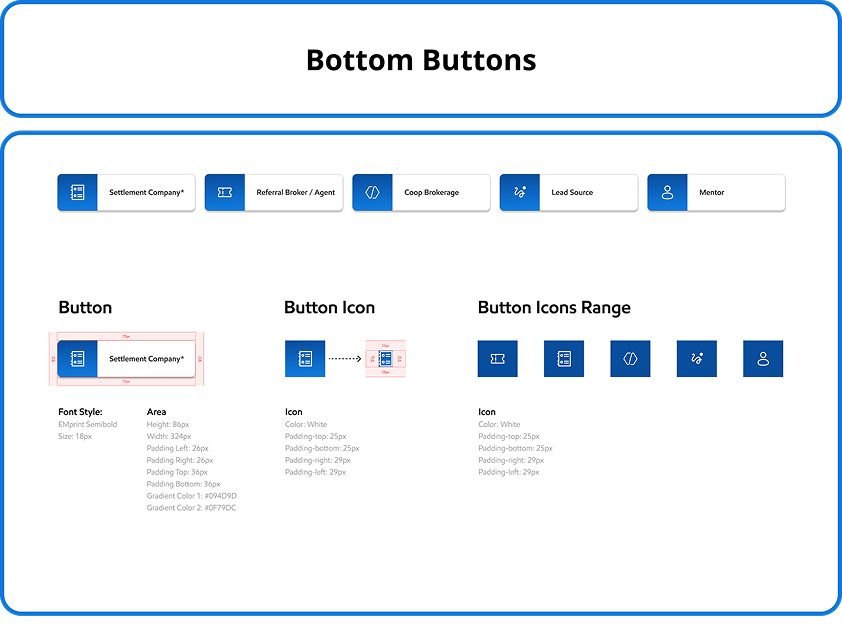

An old style tabs and text fields was a part of this screen, no any interactive look on screen.
On the existing screen there was no any filter options and the list and options was very congested.


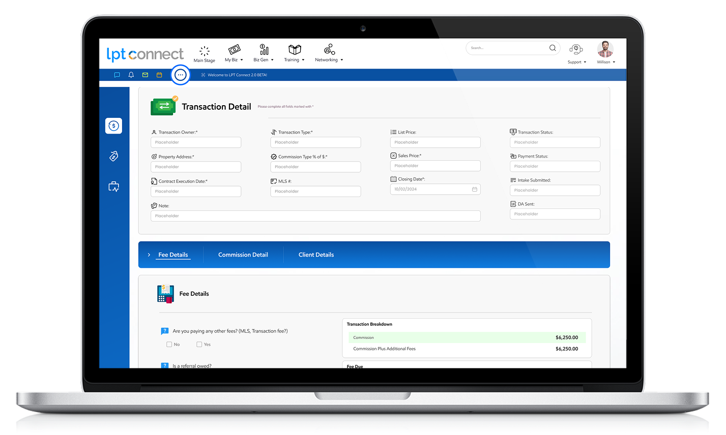


Prototype link
The LPT Connect Intake Wizard revolutionizes client onboarding by automating form collection, streamlining transactions, and ensuring secure data handling.
Its modern platform reduces administrative workload while enhancing agent commissions and real-time communication. By eliminating bottlenecks and improving data security, it delivers a seamless, user-friendly experience for both clients and professionals. This innovative solution sets a new standard for efficiency and engagement in digital onboarding.
