


U.S. Bank partnered with Zafin to modernize how relationship-based pricing is configured and delivered across banking products. The goal was to give pricing analysts, product managers, and operations teams a single, trustworthy interface for managing interest rates, personalized offers, and product configurations — across channels, at scale.
The challenge was not just a UI problem. It was a system clarity problem: users couldn’t see how their inputs connected to pricing outcomes, and they were navigating three disconnected tools to complete a single workflow.
Significant reduction in downstream pricing errors attributable to the inline validation patterns and confirmation states introduced in the redesign.

Improvement in task completion rates across core configuration workflows, measured through pre/post usability testing.

Faster feature adoption following launch — pricing analysts reached proficiency in one-third the time compared to the legacy system.
A platform that enables financial institutions to:
The existing system was fragmented across multiple tools and workflows:

The core issue was not usability—it was lack of system clarity.
Users don’t just need better interfaces—they need to understand how data, rules, and outcomes connect across systems.
I designed a unified pricing experience that:

Problem:
Users navigated across multiple disconnected systems
Solution:
Impact:
Improved efficiency and reduced mental overhead
Problem: Users couldn’t understand how pricing decisions were derived
Solution:
Impact: Increased trust and reduced errors
Problem: Multi-step workflows were difficult to manage
Solution:
Impact: Faster task completion and improved usability
Problem: Users lacked confidence in outcomes
Solution:
Impact: Improved accuracy and decision confidence
Configuring Personalized Pricing
Goal:
Enable users to move from setup to execution with clarity and confidence
Design Decisions & Trade-offs
1. Information Overload
Initial designs surfaced too much data at once
Issue:
Users felt overwhelmed
Iteration:
2. Lack of Guidance in Complex Flows
Users needed more support during multi-step processes
Issue:
Increased errors and confusion
Iteration:
3. Weak System Feedback
Users were unsure if actions were successful
Issue:
Reduced trust and confidence
Iteration:




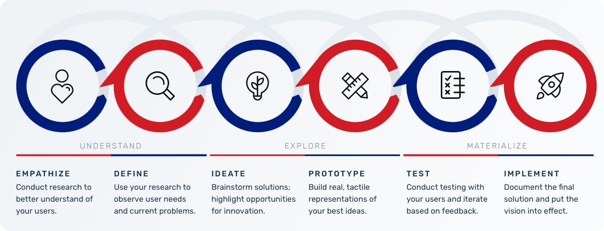
The legacy system forced pricing analysts to move between three separate tools to complete a single pricing configuration. There was no unified view of how rules, customer attributes, and rate outputs connected. Users had built personal workarounds — spreadsheets, handwritten notes, Slack threads — to compensate for what the system couldn’t surface.
The visual design compounded the problem: dense information with no hierarchy, small labels, inconsistent patterns across screens, and no feedback states. Users couldn’t tell if their actions had registered, which led to duplicate submissions and downstream pricing errors.
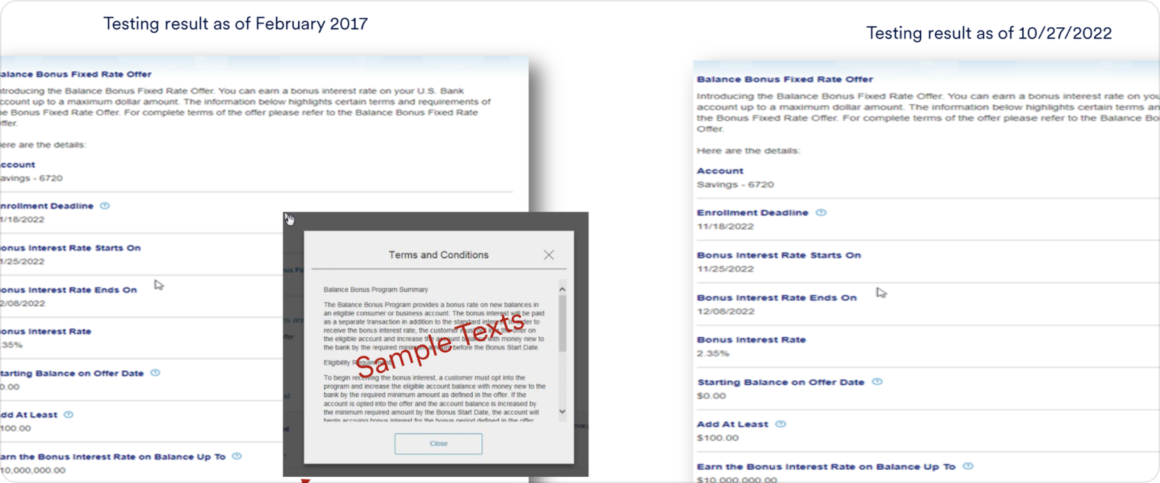
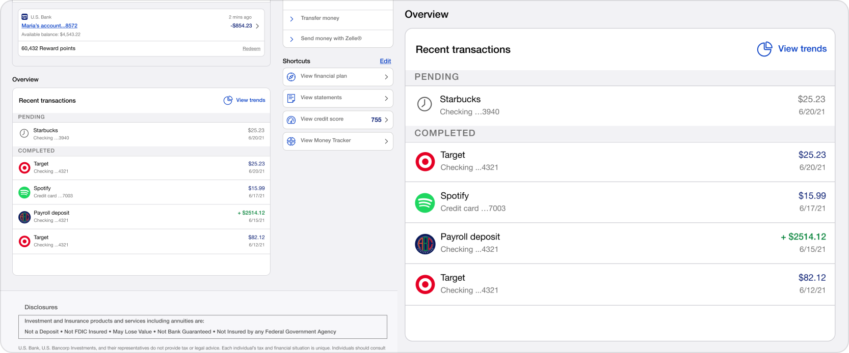
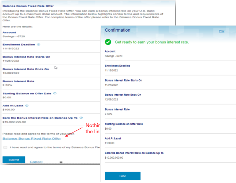
The most consequential fields — those where an error would cause downstream pricing failures — were surfaced prominently with inline validation and confirmation patterns, reducing mistakes before they reached production.

Unclear data visualization without proper explanations might leave users confused about their financial standing.

Small labeling on buttons can make it difficult for users to understand what each action does.

Some screens has confusing layout or lack intuitive navigation, making it difficult for users to find what they need quickly.

Slow loading times or crashes issues are frustrating and discourage users from relying on the app for managing their finances.

Research focused on understanding how pricing analysts, product managers, and operations teams actually worked — not just what they said they needed.
Through contextual interviews and workflow observation, three core breakdowns emerged consistently across all user groups:
First, users had no mental model of how the system worked end-to-end. They knew how to complete individual steps but couldn’t predict how their inputs would affect downstream outcomes. This caused hesitation, duplicate work, and over-reliance on colleagues for validation.
Second, the existing interface provided almost no feedback. Actions felt unconfirmed. Users refreshed pages, resubmitted forms, and created manual verification steps outside the system — all symptoms of a trust deficit with the tool.
Third, the information architecture reflected how the system was built, not how users think. Pricing logic was organized by technical module rather than by workflow stage, forcing users to hold context across screens rather than building on it progressively.
Design based on what already works.


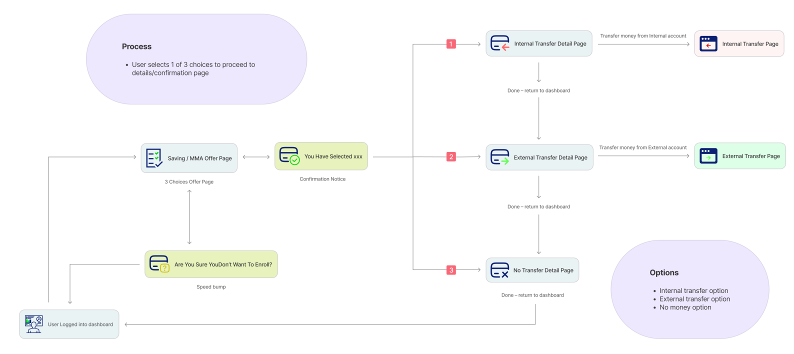
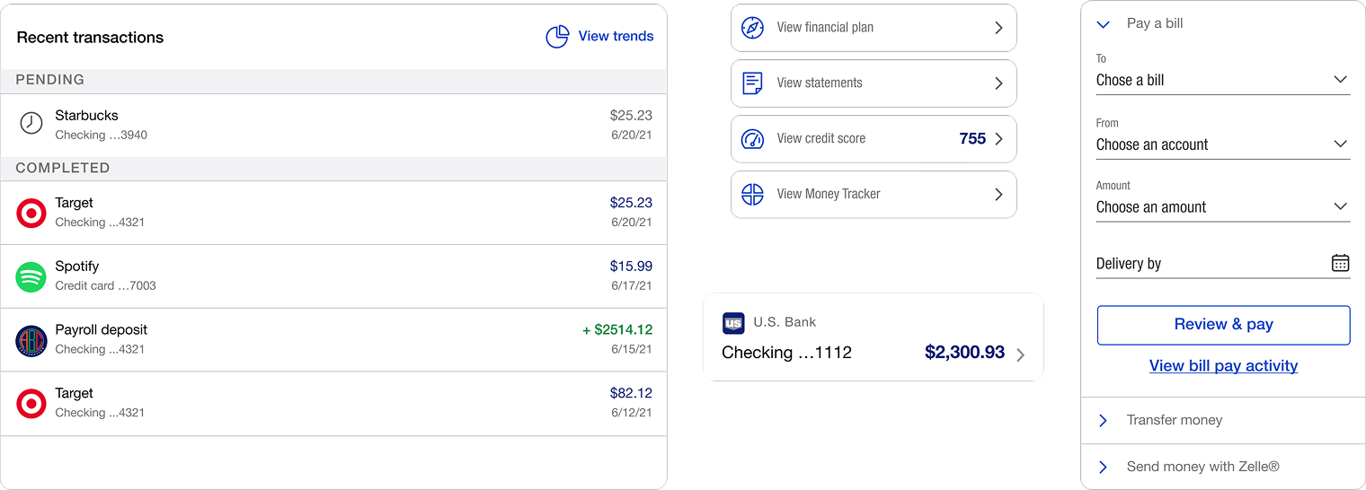


Usability testing focused on how users navigated complex pricing workflows, interpreted critical information, and completed configuration-related tasks within the platform. The goal was to identify areas where unnecessary steps, unclear information, or limited system feedback were creating friction in the overall experience.
The sessions highlighted recurring challenges around accessing frequently used workflows, understanding important configuration details, and feeling confident before committing changes. These insights helped shape a more intuitive and structured experience, with clearer information hierarchy, improved guidance, and stronger validation throughout key interactions.
The findings were organized into three core themes that directly informed the final design decisions: Navigation Efficiency, Information Clarity, and Workflow Confidence.

Navigation Efficiency
Users found frequently repeated tasks difficult to access through long navigation paths.
Design Response
Introduced configurable shortcuts that made frequently used workflows faster to access and reduced effort on routine tasks.
Information Clarity
Users needed clearer visibility into important pricing configurations and system states.
Design Response
Improved information hierarchy, labels, and contextual guidance across key workflows to make critical details easier to understand.
Workflow Confidence
Complex configurations required stronger feedback before users committed changes.
Design Response
Added clearer validation, confirmation states, and progressive disclosure to help users complete tasks with greater confidence.

Designing enterprise systems is not about eliminating complex features—it’s about making intricate systems understandable and highly usable. This project reinforced that:
The skills I built here — designing for regulated data, managing complex form states, and building scalable components within a design system.
Hey, thanks for checking out my work.
I’ve been fascinated with the way people interact with technology since forever. I’m particularly keen on digital products designed to make life easier for human beings.
What are you working on?
If you want to know more about my design process, or if you want to talk about a cool idea, don’t hesitate to hit me up.