Project Goal

To create an enriching learning environment that nurtures social, emotional, cognitive, physical, and language development.
Group 164734 (1)
Rectangle
Rectangle

Problem Statement

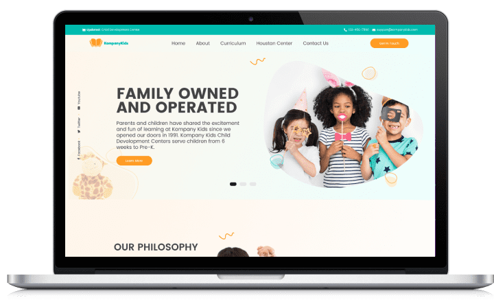
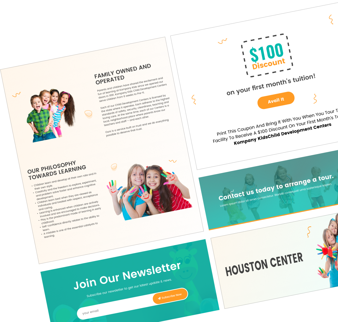
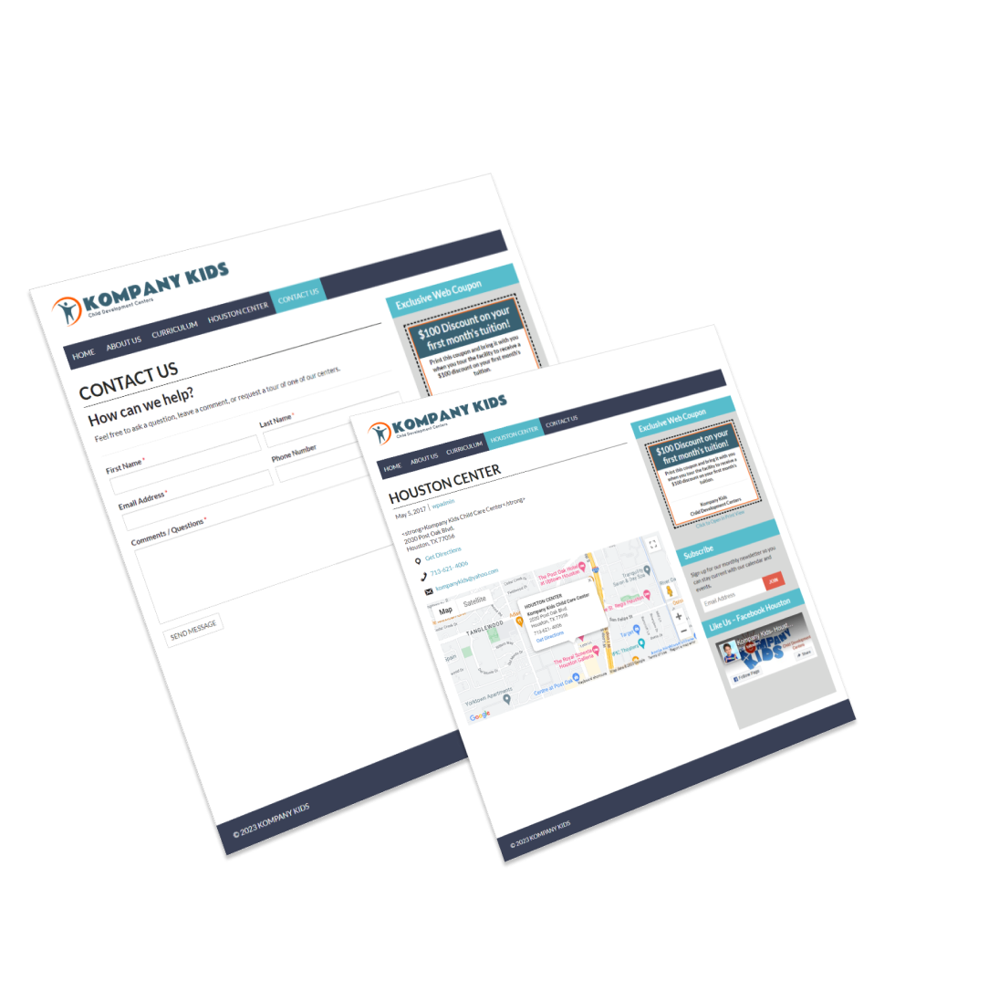
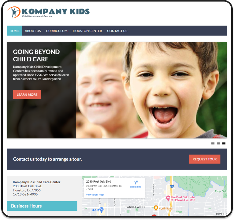
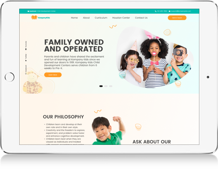
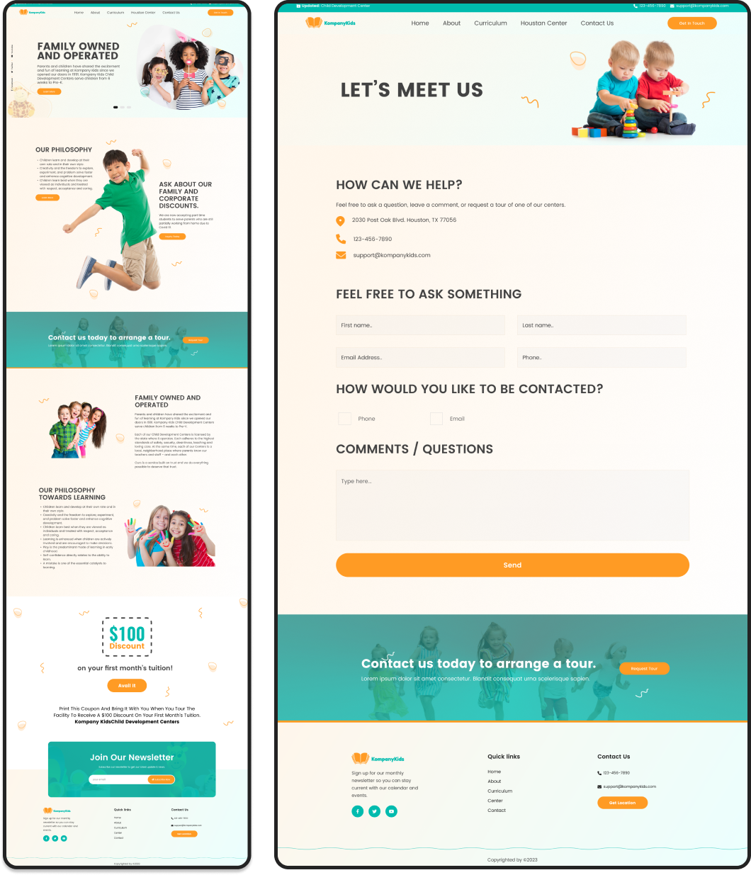
There’s a necessity to revamp the website for enhanced functionality and aesthetic appeal while ensuring accessibility and usability. Address issues such as high exit rates, subpar design, low search rankings, mobile incompatibility, broken links, slow loading, and security vulnerabilities.
Layer 1

Process

Group
User research, user flows & user journey refinement
Group
Digital wireframe suggestions and Final Design
Group
User research, user flows & user journey refinement
Group
Persona review Ideation
Group

Project Timeline

Group

User Journey

A visual representation of the paths users might take to accomplish their objectives on the website, ensuring ease and efficiency.
Group 164800 (1)

Colors

Group

Typography

Frame
Frame

Poppins Regular

Poppins Bold

Regular

1234567890

Bold

abcdefghijklmnopqrstuvwxyz

Frame
Frame
Geometric sans serif typefaces have been a well-known style tool ever because these actors took to the world’s stage. Poppins is one of the newcomers to this long tradition. With help from the Devanagari and Latin writing systems, it is an internationalist take around the genre.
Aa (1)

Elements & Visuals

UI Design focuses on intuitive access and understanding, harmonizing interaction design, visual aesthetics, and information architecture.

Headings

Group
Group

Existing Screens

Recognize inefficiencies and set clear objectives for a strategic website redesign. Address outdated elements, unclear pathways, and design flaws for optimal user experience.
Group
Updating your website is important for a variety of reasons.
  • Need a New Design
  • Need a better user experience
  • Need a quick response and instant contact details.
Bright backgrounds, old-fashioned fonts, and typeface too small for reading are all signs that your website is outdated. If this is the case, it’s time for a new, modern design.
  • There’s no clear path
  • Outdated design
  • Overused stock images and icons
  • Design for the wrong reasons
  • Cute that doesn’t cut it
  • The Site isn’t optimized for mobile
  • Play hard to get
Image

New Screens

Revamp with a fresh color palette featuring vibrant green and orange hues, accompanied by crisp departmental imagery. Incorporate the Poppins typeface and prioritize a clean design with ample white space.
Group
We use primary colors with a modern mix of Green and orange, plus all-new photography. We utilized new sharp images of related departments, combined with Poppins typography with simple white space.
Group
Group

thanks for watching

Have a project? Please inbox us.