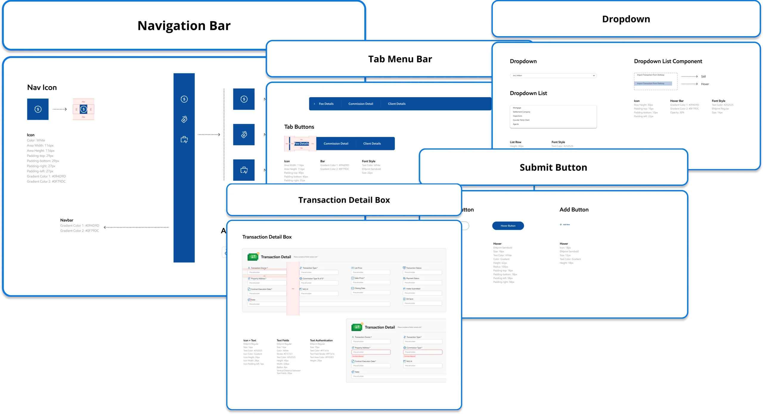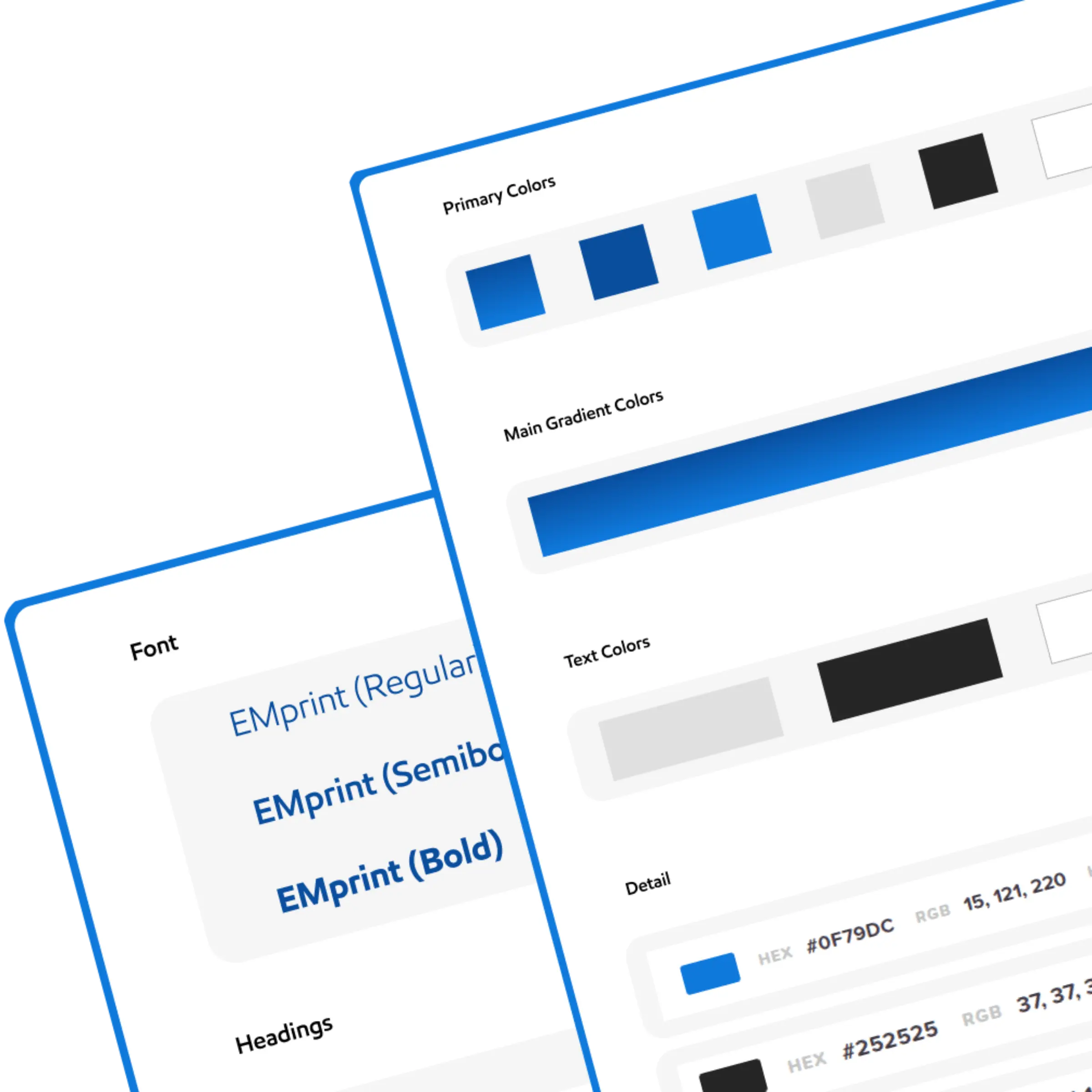
This case study explores the creation of a Design System for a Dashboard System used for data visualization, analytics, and user management. The goal was to ensure consistency, scalability, and efficiency in UI development while improving the user experience.
Before implementing the design system, the dashboard had:
I had the responsibility of ensuring that our design system helped us moved faster together.
I established documentation and a practice of critique and governance on the design side to evolve the system, and had kick-started the process on the engineering side to make the design system a shared priority between design and engineering.

We updated our design template to add a dedicated location for any component variations or additions. Designers brought components to design critique, and engineers had visibility into suggested permutations to provide early feedback. Overall, this helped us decrease creep, as we were forced to be much more intentional about accepted component changes.

I made use of Figma's branches capabilities to create rules for merging new components into the system. Designers were unblocked incorporate new changes after they had received suitable review.

While the engineering team worked on updating Storybook, I assembled a Figma prototype that housed our documentation that anyone could reference. This included deep dives into the use and constraints for each component, and general information on contributing to the system, easily navigable for quick use.
The governance process I established created more opportunities for designers to work together, getting early visibility into how the system was emerging across the product.
This visibility expanded as we hired a dedicated front engineer and started to pull the visual system into code.
Most components lacked documentation. Where documentation did exist, it was directed at engineers for the immediate implementation of the component and was often out of date.
It was clear additional variants and options had been added over time but the documentation was never updated as well, leading to confusion about when to use which property and why.
The components themselves were brittle and complicated. Components did not cascade, and as a result it was costly to make even minor adjustments to fix errors in the component. Any variations required breaking the component or adding onto the long list of properties.
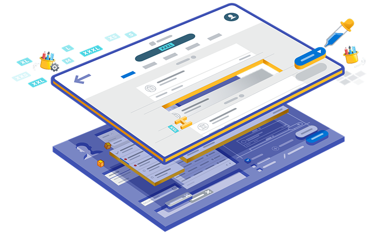
As I planned for the work of restructuring and documenting our components, I also started a campaign across PDE to educate on how design systems could support our product strategy goals.
To support this effort, I wrote an internal memo on our design system strategy, and followed up with regular updates on the team’s progress. This also supported the creation of a dedicated role in engineering to focus on design systems
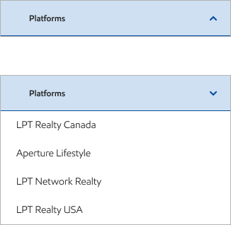
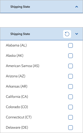
An accordion widget is a user interface element that allows you to display content in a collapsible, space-saving manner.
It typically consists of a series of titles or headings, and when a title is clicked, the corresponding content is revealed or hidden.
This helps to organize large amounts of information in a compact and user-friendly way.
With LPT Realty, you'll have access to industry-leading tools, lead generation systems, and ongoing expert training.
Share some basic information about yourself and your experience to help us get you set up.
Once your details are submitted, we'll guide you through the process of transferring your license seamlessly.





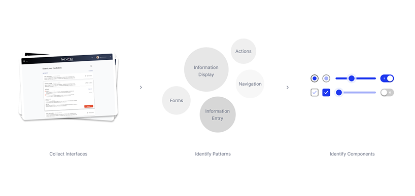
To identify any opportunity to find reusable components I mainly started scouting existing interfaces.
This initial step helped me in understanding the current design landscape and finding elements that could be standardized. Saving time and effort in creating new ones from scratch.
It also ensured that the new design system was built on a foundation of existing proven elements.

The final result was a versatile and scalable component library that met diverse client requirements while maintaining brand consistency. The system’s ability to easily customize components for different visual languages allowed to deliver tailored solutions quickly and effectively.
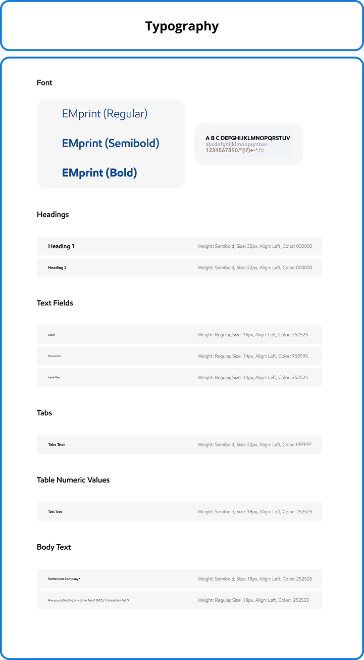
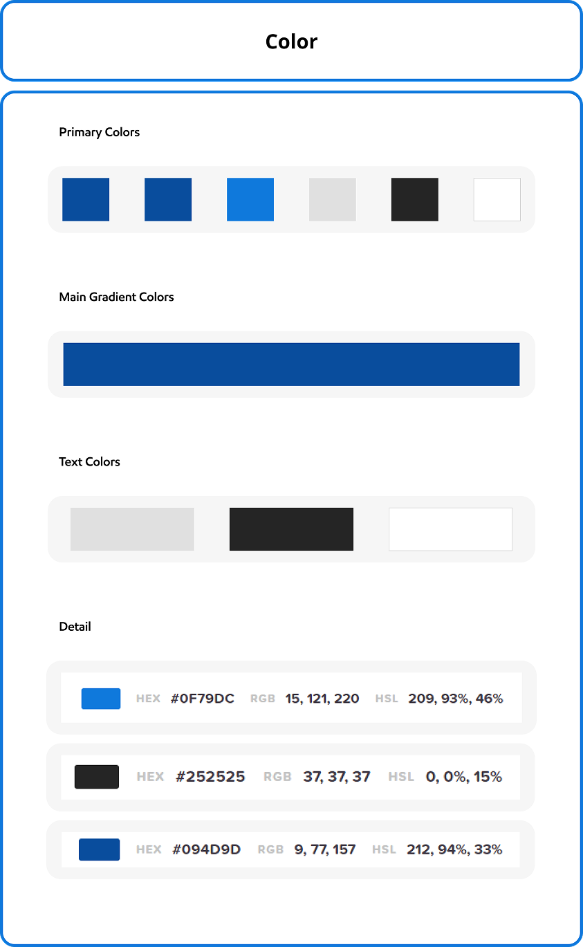
The validation process, supported by the detailed Design System Guidelines, ensured that the components were practical, user-friendly, and aligned with real-world needs.
The iterative development process taught me the value of flexibility and adaptability.
By continuously revisiting and refining our components, I learned how to integrate feedback effectively, ensuring that the final product met both functional requirements and user needs.
The importance of clear documentation also became evident, as the Design System Guidelines we created proved invaluable in ensuring consistency and ease of use across different teams and projects.
