ExxonMobil Visualization
Polaris

Data Visualization Dashboards

Visual head right

Background

Transforming planning and stewardship for the entire corporation and unlocking more value out of the company’s data. Our track specifically is looking into modernizing, harmonizing, and streamlining thousands of home-grown dashboards into a curated suite of unified tools the entire corporation will use.

Project Overview

The goal is to design an intuitive, user-friendly, and highly functional dashboard that provides real-time insights into key operational metrics for oil and gas companies. The dashboard will help users monitor, analyze, and make data-driven decisions to optimize operations, improve safety, and reduce costs.
Exxon po

Polaris Project

Data Visualization Tracker System

Company

ExxonMobil

Industry

Energy

Team

  • Project Lead
  • Product Owner
  • UX Lead
  • Power Bi Developers

Paw

Problem are we trying to solve

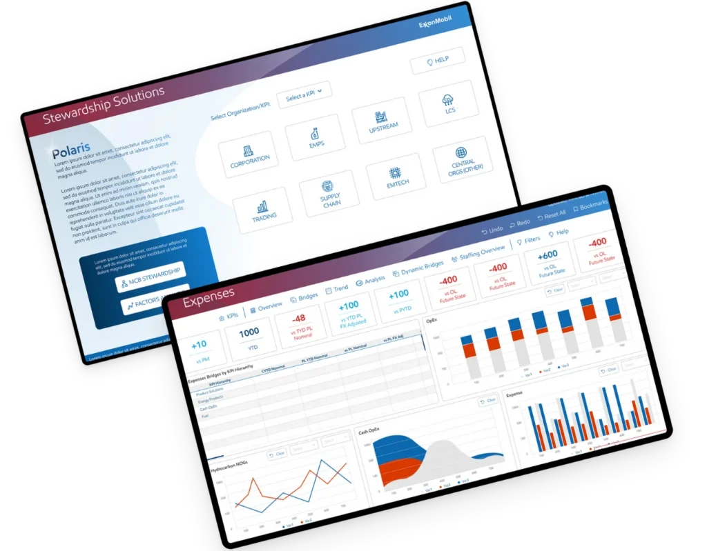
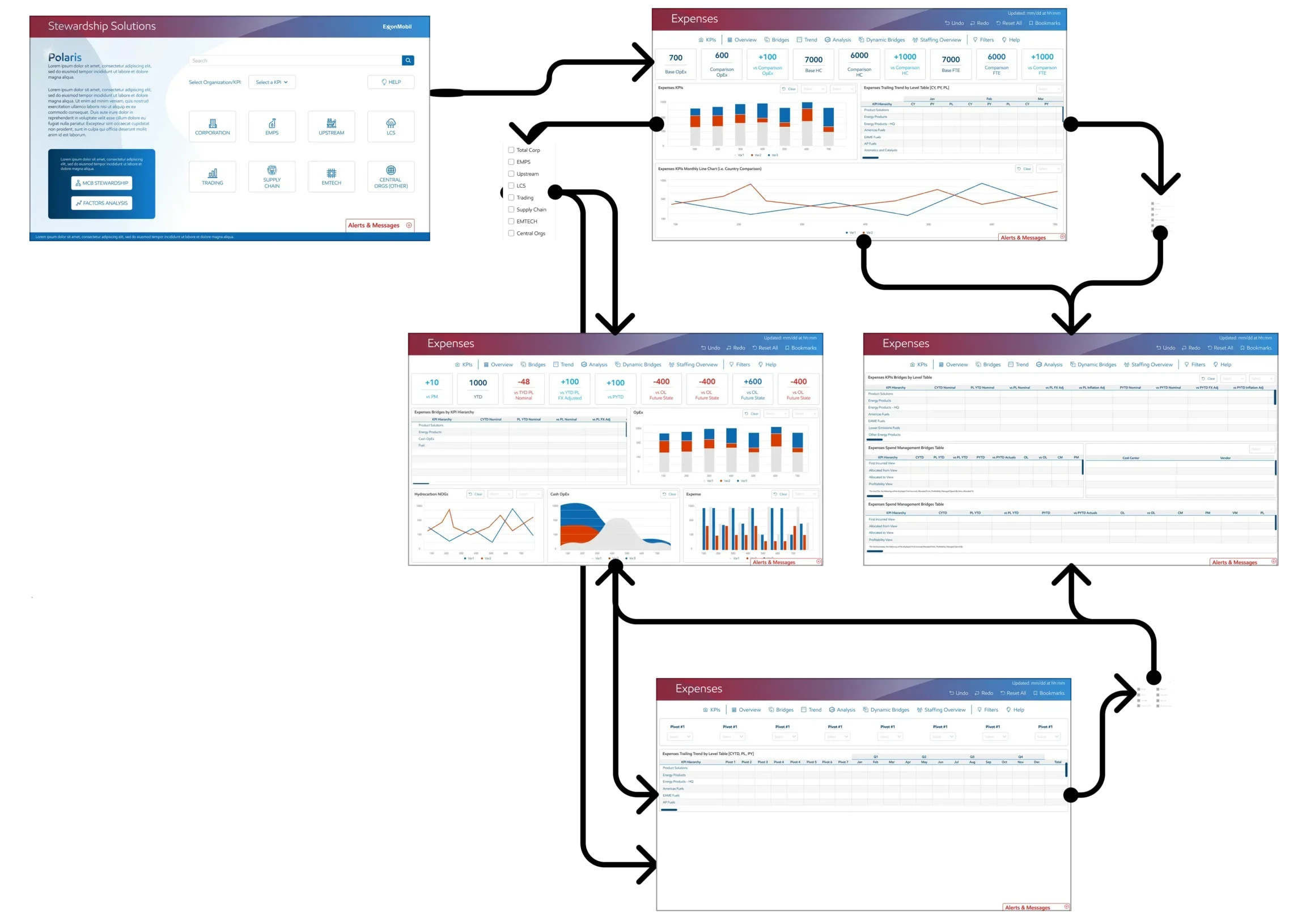
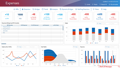
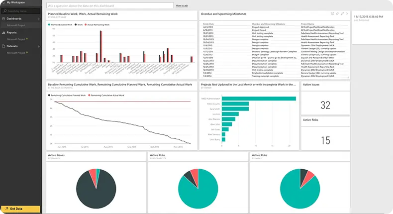
ExxonMobil's 20 dashboards likely face challenges in data management, visualization, and decision-making, and causing inefficiency and poor communication across the corporation.

Bft

Benefit for the business

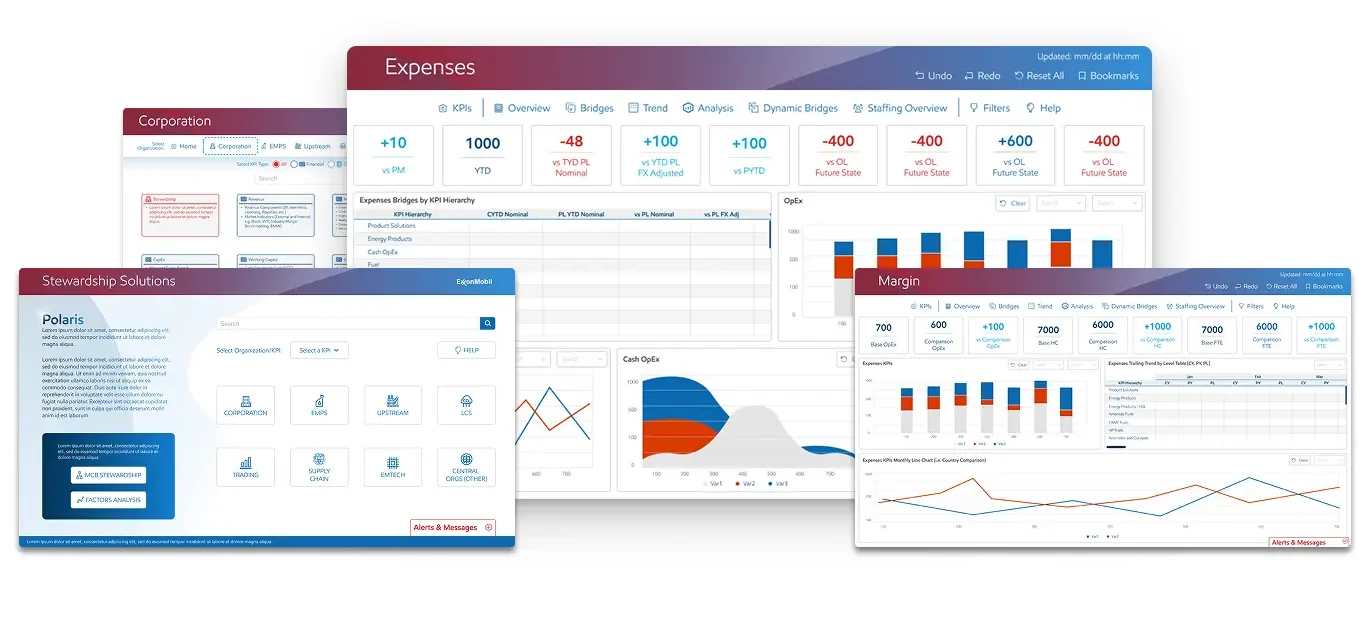
A single home for all GBS planning, stewardship, and analytical dashboard needs. Cuts down on data manipulation, data governance issues, and business not talking the same language. Customers can spend more time getting value out of the data then “working” it.

Gs

Goals / Scope

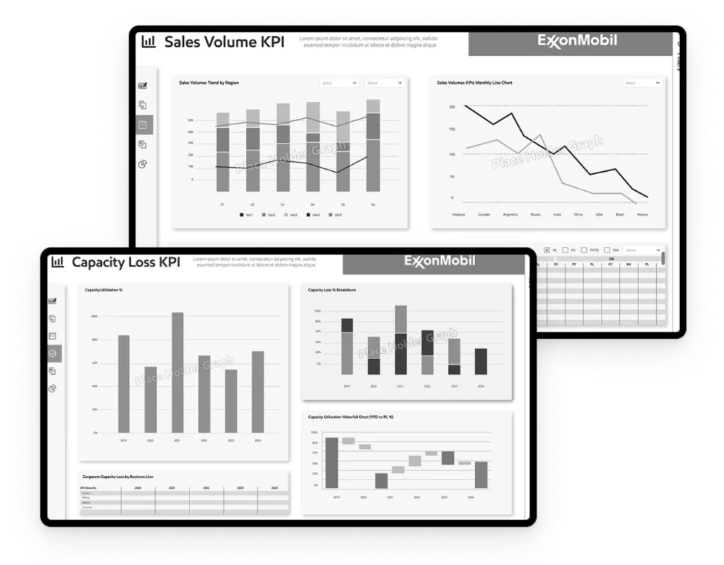
Design a user-friendly, data-driven dashboard to improve operational efficiency, safety, and decision-making for ExxonMobil.

  • Real-time monitoring of oil and gas production.
  • Enhanced safety compliance and incident reporting.
  • Improved equipment maintenance and predictive analytics.
  • Streamlined reporting for executives and field personnel.

Constraints

Constraints

  • Data Complexity: Handling large volumes of real-time data
  • Scalability: Handle increasing data volumes and user loads.
  • Cross-Platform Compatibility: Ensuring the dashboard works seamlessly on desktops, tablets, and smartphones.
  • Performance: Maintaining fast load times and smooth interactions despite large datasets.

Business Problem

ExxonMobil faces the critical challenge of balancing long-term profitability from its core oil & gas operations with the accelerating global transition to lower-carbon energy. Investor and societal pressure demands a credible, large-scale strategic pivot toward renewables and carbon reduction technologies. The company must navigate volatile commodity prices, evolving regulations, and reputational risks, while investing capital to future-proof its business without compromising current financial returns essential to shareholders.

Problem Statement

Problem

The current system fails to meet diverse user needs due to a lack of role-specific customization and contextual insights. It lacks real-time data integration, and suffers from poor data visualization.

Additionally, limited accessibility across devices disrupts seamless access to critical information, reducing productivity and user satisfaction.

Ps

Solution

I ensure data accuracy and create customizable, role-based dashboards using insights from user personas, while interactive charts and mobile-first design provide seamless, responsive data visualization across devices.
Expenses

Target Audience

The target audience for oil and gas dashboards is diverse, ranging from field technicians to executives. Each group has unique needs, goals, and pain points. Here’s a breakdown of the primary user groups:

Roles

  • Monitor and maintain equipment in the field.
  • Oversee daily operations and ensure efficiency.
  • Make strategic decisions based on high-level insights.

Needs

  • Financial performance metrics (e.g., revenue, costs, profitability).
  • Real-time equipment status and diagnostics.
  • Tools for data visualization and analysis.
  • Mobile-friendly interfaces for use on tablets or smartphones.

Pain Points

  • Overly complex interfaces that are difficult to use in the field.
  • Lack of actionable insights to improve operations.
  • Lack of integration between different data sources.
Target audience

Research & User Needs

The target audience for oil and gas dashboards is diverse, ranging from field technicians to executives. Each group has unique needs, goals, and pain points. Here’s a breakdown of the primary user groups:

Industry Research

I studied the oil and gas industry to understand its unique challenges, such as handling large datasets, real-time monitoring, and safety compliance.

Research and User Needs

Key Requirements

I summarize the main requirements, such as real-time data visualization, predictive analytics, or integration with IoT devices.

Run indicate

User Research

I gathered insights from users (e.g., interviews, surveys, or observation) to identify pain points, such as difficulty in interpreting complex data or the need for quick access to critical metrics.

Run indicate

Users Pain Point

Oil and rig dashboards are critical tools for monitoring and managing operations in the oil and gas industry.
Girl
Upp indicate
  • Problem: Inconsistent or unclear data visualization can make it difficult for users to interpret the data correctly.
  • Impact: Misinterpretation of data can lead to incorrect decisions and operational issues.
Boy
Upp indicate
  • Problem: Complex or cluttered interfaces can make it difficult for users to navigate the dashboard efficiently.
  • Impact: Users may struggle to find the information they need, leading to frustration and decreased productivity.
Boy
Upp indicate
  • Problem: Dashboards often display a vast amount of data, making it difficult for users to quickly identify key metrics or actionable insights.
  • Impact: Users may feel overwhelmed, leading to slower decision-making and potential oversight of critical issues.
Boy
Upp indicate
  • Problem: Inaccurate or poor-quality data can be displayed on the dashboard, leading to incorrect conclusions.
  • Impact: Users may make poor decisions based on faulty data, potentially resulting in operational failures or safety incidents.
Boy
Upp indicate
  • Problem: Delays in data updates can result in outdated information being displayed on the dashboard.
  • Impact: Users may make decisions based on stale data, which can lead to operational inefficiencies or safety risks.

UX Process

Pas

Project & Scope

  • Business
  • Design
  • Product
  • Technical

Perform ux

Perform UX Research

  • User research
  • Market research
  • Competitive research
  • Product research

Draft solution

Draft of a Solution

  • Sketching
  • Paper prototyping
  • Wireframing
  • Low-fidelity prototypes

Hide fidelity

High-Fidelity Mockups

  • UI component library
  • Design system
  • High-Fidelity Prototypes

Ui ut

Usability Testing

  • Validate ideas
  • Identify usability issues
  • Test accessibility

Competitive Analysis

Competitive analysis helps identify industry standards, best practices, and gaps in existing solutions.
  • Identify Competitors
  • Analyze Features
  • Benchmark Usability
  • Industry Trends
Polaris ca

Usability Test Methodologies

System Usability

System usability scale (SUS)

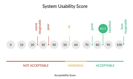
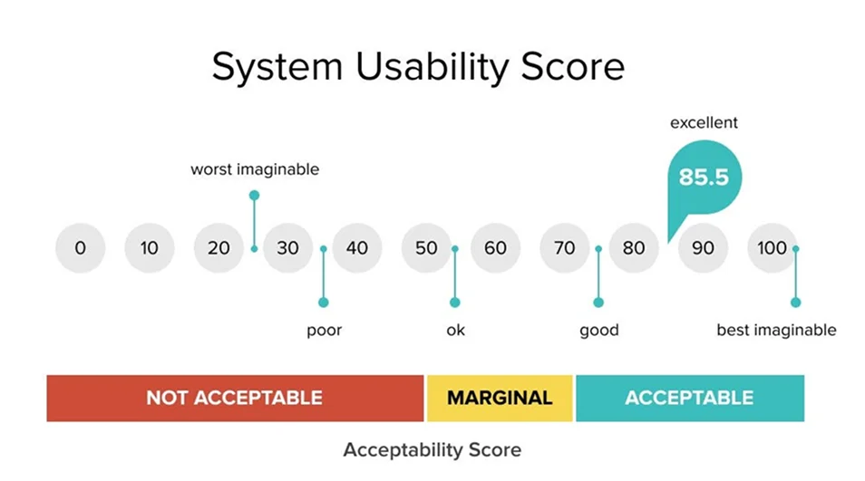
Questionnaire that offers a quick, cost-effective yet accurate way to evaluate the usability of a website.
Testers: Users

Heuristic

Heuristic evaluation

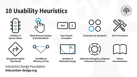
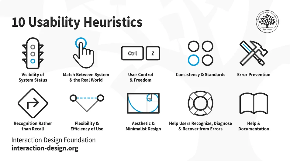
A process where experts use rules of thumb to measure the usability of user interfaces in independent walkthroughs and report issues.
Testers: UX

In depth

In-depth interview / observation

This enables the interviewer to react to the participants' statements in a flexible way, in order to learn as much as possible about their experience.
Testers: Users

Sus

System Usability Score (SUS)

10-Question questionnaire that offers a quick, cost-effective yet accurate way to evaluate the usability of a website.

Testers: 1 user/session
Duration: 10 mins
Test category: completion of a survey form

System Usability Score (SUS)

What Was Done

  • Target Audience: Likely involved users who regularly interact with the dashboards (e.g., analysts, managers, executives).
  • SUS Survey: I asked users to complete the SUS questionnaire after using the dashboards.

Analysis

  • SUS score was 85 or higher: The dashboards were highly usable, and the initiative could be considered successful.
Sus audience

Heuristic Evaluation

A method to identify usability issues in a user interface by evaluating its compliance with recognized usability principles (heuristics). Conducted by a small set of UX evaluators, it helps prioritize improvements in an iterative design process.

Testers: UX
Test category: evaluation from 10 aspects

10 Heuristic
In depth interview

In-depth Interview / Observation

An open discussion within a defined topic. This enables the interviewer to react to the participants’ statements in a flexible way, in order to learn as much as possible about their experience.

Tester: 2 tester / session
Duration: 30 – 60 min
Test category: task-based, open-discussion, User observation

AI Integration

  • Intelligent Financial
  • Automation Monitoring & Environmental Compliance
  • Real-time Production Optimization
  • Predictive Maintenance
  • Data Interpretation & Analysis
  • Enhanced Safety
  • Cost Reduction
  • Improved Efficiency
  • Better Decision-Making
AI Integration

Color Role

Color roles describe the intention behind the color. For example, color roles are applied to buttons to differentiate between primary, secondary, warning, or dangerous actions. Use for default text and secondary UI elements, such as secondary buttons or navigation elements.
Color theme polaris
Blue polaris
Utility colors polaris
Red and orange polaris
Modular Design

Modular Design System

I create a design system for Exxon dashboards to ensure consistency, usability, and scalability. This system includes role-based templates, intuitive navigation, and responsive layouts to cater to diverse user needs.

I aim to enhance decision-making and user satisfaction. The design system also prioritizes accessibility, ensuring seamless performance across devices while maintaining a cohesive and user-friendly experience.

Typography

Typography involves font style, appearance, and structure, which aims to elicit certain emotions and convey specific messages. In short, typography is what brings the text to life.
Polaris size
Polaris wording
Polaris font family

Wireframes

A wireframe is a rough schematic created in the early stages of digital product design to help visualize and communicate the structure of a product or website.
Polaris Wireframe
Polaris ui

User Interface

User interface (UI) design is the process use to build interfaces in software or computerized devices, focusing on looks or style. Our aim to create interfaces which users find easy to use and pleasurable.

Prototyping

Prototyping is the process of developing an analog or digital draft of a design or product, allowing a developer to explore how the creation will function before making the final product. It provides a ways to test and explore the design without using too many resources.
Polaris prototyping

Usability and Accessibility

User-Friendly Interface

I prioritized simplicity and ease of use, even for non-technical users.

Polaris usability

Accessibility

I ensured the design is accessible to all users, including those with visual impairments (e.g., high-contrast mode, screen reader compatibility).

Usability indicator

Testing and Feedback

Testing and feedback

User Testing

I conducted usability testing with real users to validate the design.

Iterations

I get incorporated feedback to refine the design, such as improving navigation or adjusting the layout for better readability.

Impact

I summarize the dashboard improves efficiency, decision-making, or safety for users in the oil and gas industry.

What we have done with

We adding latest trends to improve user experience more effective, user-friendly, and aligned with the industry’s evolving needs.

  • Improved Decision-Making
  • Actionable insights
  • Increased Efficiency
  • Better User Adoption
  • Improve user satisfaction
  • Enhanced Safety
  • Scalability
New Interface

New Interface

New interface indicator
Polaris Existing

Existing

Polaris impact

What was the impact? Where do things go from here?

The impact of the design was a significant improvement in user satisfaction and efficiency, as role-based dashboards and real-time data integration streamlined workflows for the design team, developer team, and business users.

  • Improved User Satisfaction
  • Increased Efficiency
  • Better Collaboration
  • Enhanced Decision-Making
  • Iterative Improvements
  • Incorporate Feedback
  • Expand Accessibility Features
  • Seamless Communication
  • Enhanced Usability
  • Sustained Value

Reflection

Working on the Polaris dashboards was a valuable and rewarding experience. It allowed me to deeply understand how effective data visualization and intuitive user interfaces can transform complex operational data into meaningful insights.

  • Valuable Experience
  • Data Visualization Impact
  • Cross-Functional Collaboration
  • User-Centric Approach
  • Teamwork & Communication
  • Iterative Testing
Reflection

Thank You

ExxonMobil