Tracking System

Line
Banner Image

Overview

The LPT Connect Intake Wizard is an AI-powered digital onboarding tool designed to streamline the client intake process for agents and professionals. It automates form collection, enhances transaction details-client matching, agent commissions and ensures secure, compliant data handling—reducing administrative workload while improving engagement.
Users struggled to locate files quickly due to an inefficient folder hierarchy. Too much information was displayed at once, leading to cognitive overload.
Solution Image
Allow users to see detail in thumbnail view with indication. Display information with trendy font with clean design.

Project Timeline

Research
Setting Goals
Scope Agreement
Wireframing
User Journey UX
Sitemaps
Content Creation
Desktop Design
Mobile Design
Code & Functionality
Optimisation & Performance
QA & Testing
Post-Live Checks
Publishing & Promoting
Support & Maintenance

Design Process

Ts Empathize

Emphasize

  • User Research
  • Interviews
  • Competitors Analysis
  • Survey

Ts define

Define

  • Problem Statement
  • User Personas
  • Empathy Map
  • Story Board

Ts Ideate

Ideate

  • Brain Storming
  • User Flows
  • Information Architecture
  • Sketching

Ts Prototype

Prototype

  • Mid-Fi Wireframes
  • Visual Design
  • Prototype

Ts testing

Testing

  • Usability Testing
  • Getting Feedback
  • Conclusion

Participant Demographics

Users Age

Ts user age

Phone Type

Ts phone type

Internet Browser

Ts Internet Browser
Ts pd

User Persona

I learned about the users by creating detailed profiles called user personas, helping me understand their needs, goals and frustrations.
Sarah Thompson Profile Image

Sarah Thompson

Organization

20

Location

New York

Age

24 Years

Occupation

Sales Manager

Tech Sevy

Social Skills

Org Activity

Biography

Sarah has been working in project management for over 8 years. She manages multiple projects simultaneously and collaborates with various teams, including design, content, and development. She is tech-savvy and uses various software tools to streamline her workflow.

Frustrations

  • Finds it difficult to keep track of who has accessed or modified files.
  • Often struggles with updates, leading to confusion among team members.

Needs

  • To reduce the time spent searching for files and improve overall productivity.
  • To efficiently track and manage files.

Personality

Internet

Ts

Socialmedia

Ts

Online Shopping

Ts

Personality

Extrovert

Introvert

Ts extrovert

Thinking

Feeling

Ts thinking

Empathy Mapping

Empathy maps provides a simple view of what users say, think, feel, and do. It helps to understand their experiences.

Says

  • “It’s important that I get real-time updates on changes.”
  • “I don’t want to miss any notifications about the file status.”
  • “The system should be clear and easy to understand.”

Does

  • Checks the tracking system frequently to monitor file status.
  • Sets alerts or notifications for critical updates or delays.
  • Uses the tracking info to plan next steps or escalate issues.

Think

  • “Is the tracking information accurate and up-to-date?”
  • “Am I the only one responsible for following up on these files?”
  • “Can I easily spot issues or delays without digging too much?”
  • “Will this system save me time compared to manual tracking?”
Empathy Mapping Image
Blue Mapping
Orange Mapping
Orange Short Mapping
Blue Long Mapping

Feels

  • Confident when the system provides timely and clear updates.
  • Frustrated if the tracking data is delayed or inaccurate.
  • Anxious when a file’s status is unclear or missing.

Typography

Ts typography
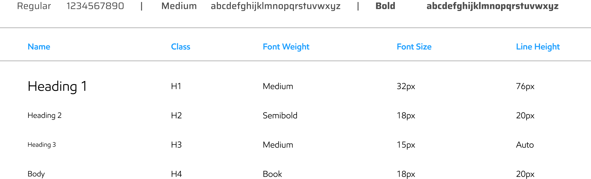
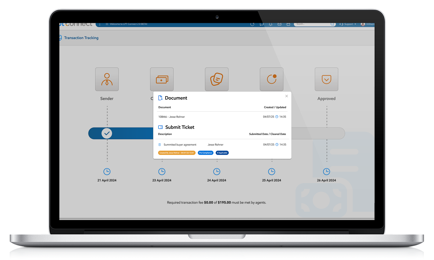
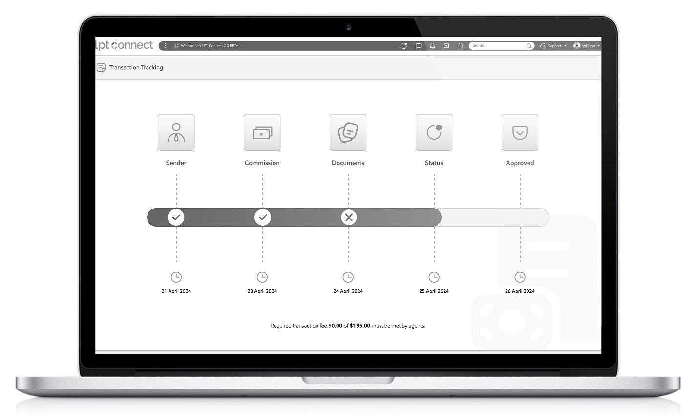
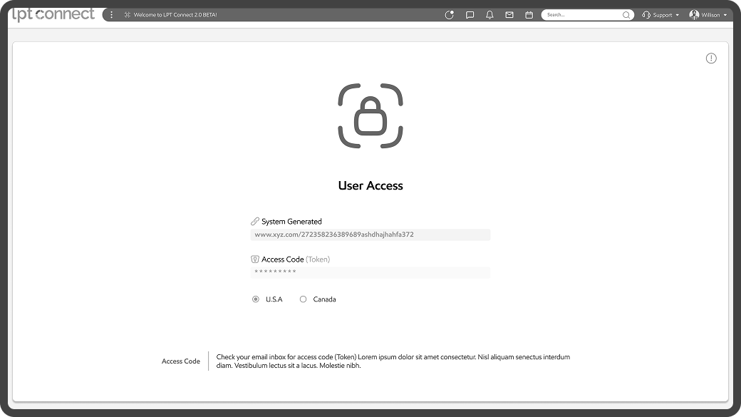
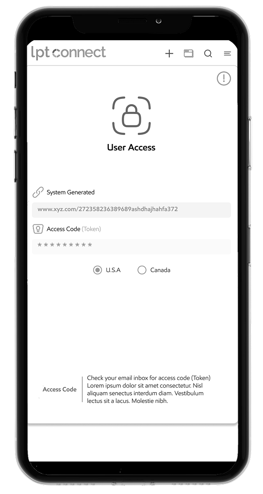
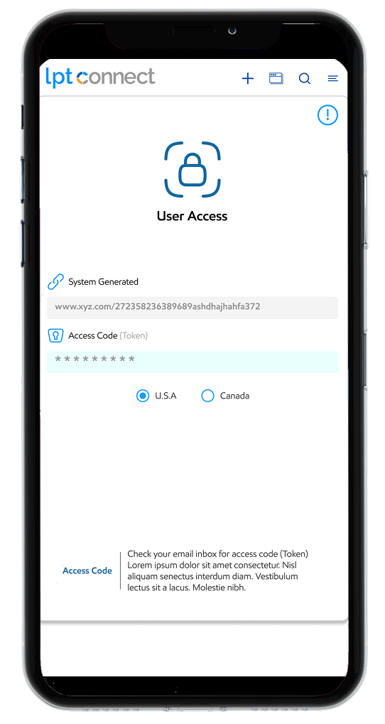
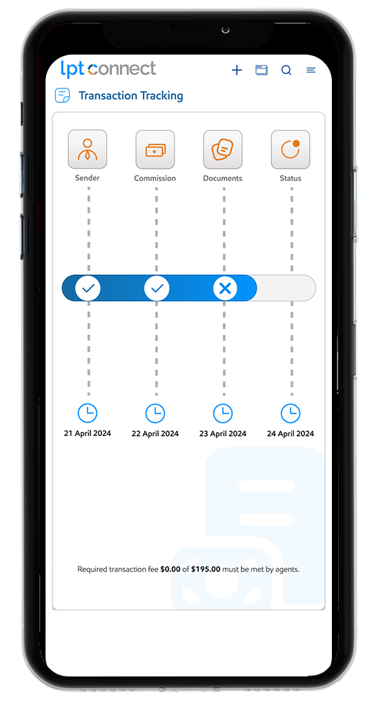
A great design system helps you design and build digital products a lot faster because they give you access to icons, typography rules, color palettes, and other design rules to follow during app or web development and the Fonts for apps play a major role in your users’ experience. We have used more advanced and trending font.
Ts typography chart

Colors

Primary Colors

Ts primary colors

Main Gradient Colors

Ts main gradient color

Main Gradient Colors Details

Ts color codes

Text Colors

Ts text color

Icon Set

As a pictogram, an icon is a graphical representation of an object, place or idea.
Ts icon set
Ts checklist
Ts timer

AI Tools (We Use)

Al Tools
Enhances human creativity with generative AI. We use AI Tools for generate some kind of images and icons.
Ts tools icon

Icons

User Research

Users struggle to stay consistent without reminders or clear weekly tracking.

Many users find layout cluttered and confusing, especially for beginners

Users want runtime indications

What We Have Done

Ts mobil

In this screen:

  • We improved the responsive design.
  • Users can check status at runtime.

Arrow UP

Responsive Layout

Ts desktop

In this screen:

  • We added thumbnail view of runtime status.
  • Details and indication added.

Arrow UP

Responsive Layout

Features & Functionality

Low Fidelity

Low-fidelity refers to a state of reduced quality or detail, commonly used in contexts like audio, visual representations, and prototyping.
TS Desktop View

Desktop View

TS Low Fidelity Desktop
TF User Access
TS Mobile View

Mobile View

TS Mobile View
TS Mobile View

High Fidelity (Desktop)

IW High Fidelity (Desktop)

Transaction Detail

TS High Fidelity

User Access

TS High Fidelity

Popups

High Fidelity (Mobile)

High fidelity (hi-fi) design closely matches the final result of a product’s design. Content, visual styles, and animated transitions — all work together to make high fidelity assets look and work as close to the final product as possible.
High Fidelity Mobile

User Access

High Fidelity Mobile

Transaction Tracking

TS Prototype

Prototype

Prototype link

What I Have Learned

  • User-Centric Approach Matters: Prioritizing intuitive navigation and clear data visualization significantly improves usability.
  • Consistency is Key: Maintaining uniform design elements (colors, fonts, buttons) enhances user experience and brand identity.
  • Feedback Loops Help: Regular user testing revealed pain points early, allowing for iterative improvements.
What I did Do Differently

What I’d Do Differently

  • Simplify Complex Features: Avoid overloading dashboards; use progressive disclosure for advanced options.
    Optimize for Mobile
  • Earlier: Design responsively from the start rather than retrofitting later.
    Document Design
  • Decisions: Keep better records of UX choices to streamline collaboration with developers.
Challenges Overcome

Challenges Overcome

  • User Onboarding: Created interactive elements to reduce the learning curve.
  • Cross-Team Alignment: Used wireframes and prototypes to bridge gaps between designers and stakeholders.